Highly Inspiring
Ymdaith (The Journey)
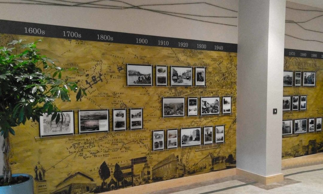
Reaching Wider, uwtsd – CARMARTHEN, WALES
Bi-lingual workshop brand
Based within the University of Wales Trinity Saint David, the South West Wales Reaching Wider Partnership aims to increase participation in and widen access to higher education particularly to those people who live within the bottom 40% of the Welsh Index of Multiple Deprivation, care experienced young people, and carers.
It is a service based offering that connects children and young people at schools and community groups to higher education including universities. One of such programmes developed for those currently in primary and secondary school is Ymdaith, a series of eight workshops designed to inspire, engage and instil a sense of fun and achievement with learning.
We were delighted when the UWTSD approached us to create a complete brand identity for their workshop series; the biggest challenge would be developing a coherent design language that could appropriately span across 7 academic year groups (ages 9 to 16), and work both in English and Welsh languages.
Industry
Education
Children
Services
Naming
Logo Design
Brand Identity Design
Graphic Design
Slideshow Templates
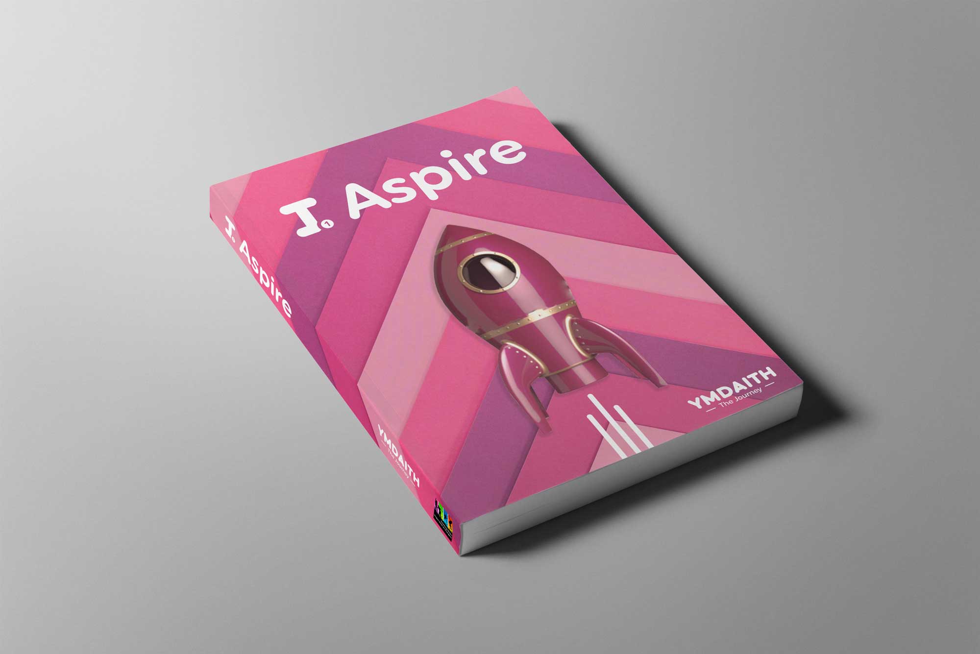
Ymdaith, translated from Welsh, means “The Journey.”
The 8 workshops are designed with the intention that children and young people attend each one throughout their time at school. Not only are the workshops created to bring young people on a journey to further education but each workshop is a progression of the previous, a journey in itself.
The Logo Design
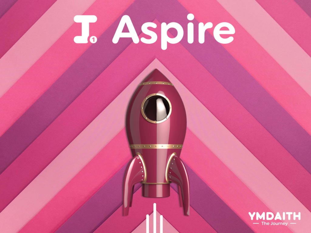
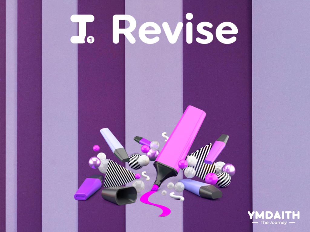
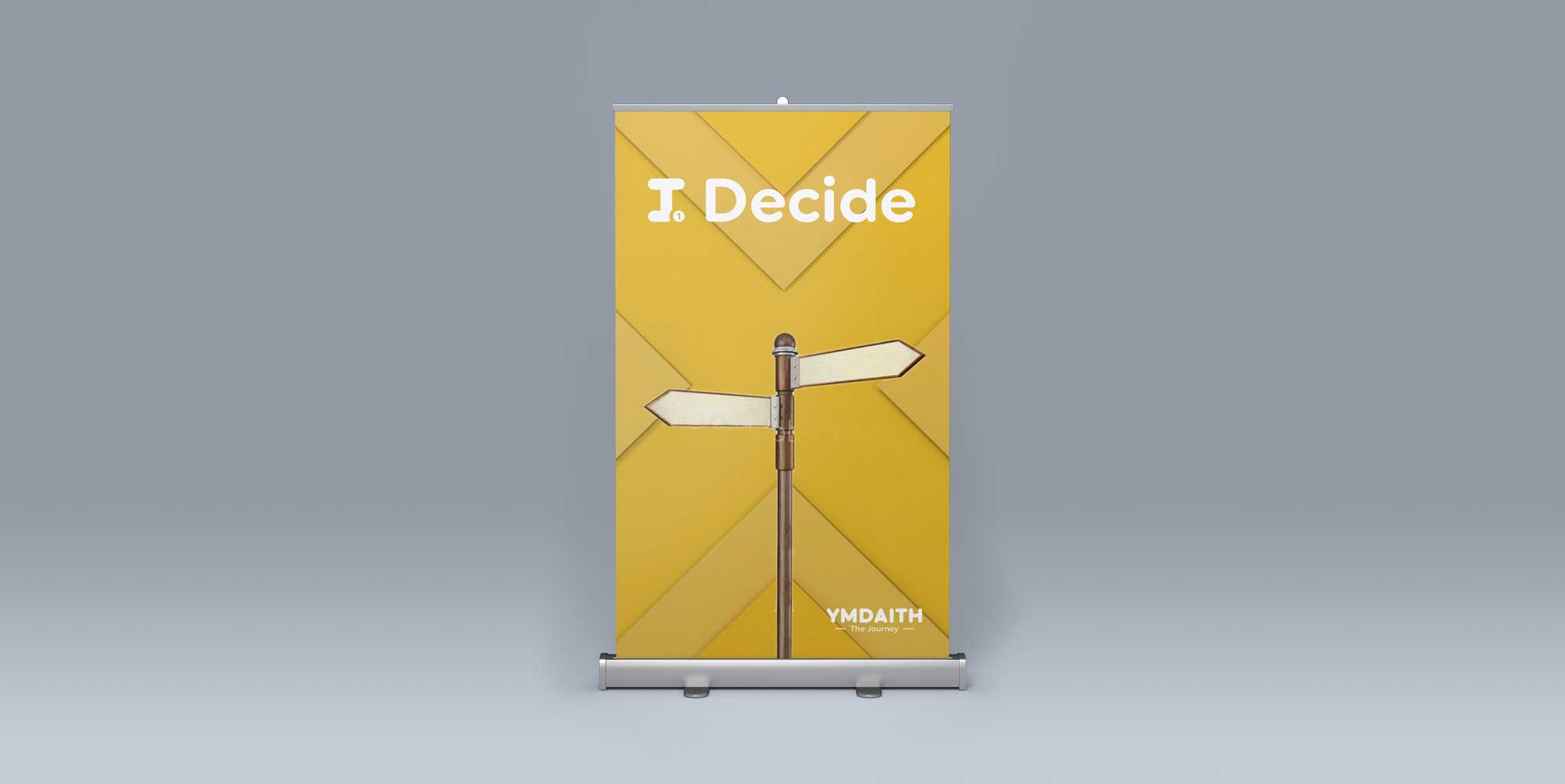
The Ymdaith logo is a wordmark that has been constructed from a series of simple shapes: circles and rectangles. The simplicity in form relates to the child/youth’s experience with Ymdaith. Similarly to Ymdaith being made of 8 different workshops, when pieced together completes the full picture, the Ymdaith logo is made of simple shapes (circles and rectangles) when pieced together complete the logo. The multi-coloured logo not only speaks of vibrancy, fun and diversity of the project but the chronology of the colours also directly relate to the progression through the workshops. The first workshop (I:Aspire) utilises a pink colour-palette, noted in the ‘Y’, and works through each letter to finish the ‘H’ on a purple colour-palette, the same colour-palette used on the last workshop in the series (I:Revise).
> 500 Logo Variations
Workshops
Key Stages
Languages
Styles
Lockups
File Types
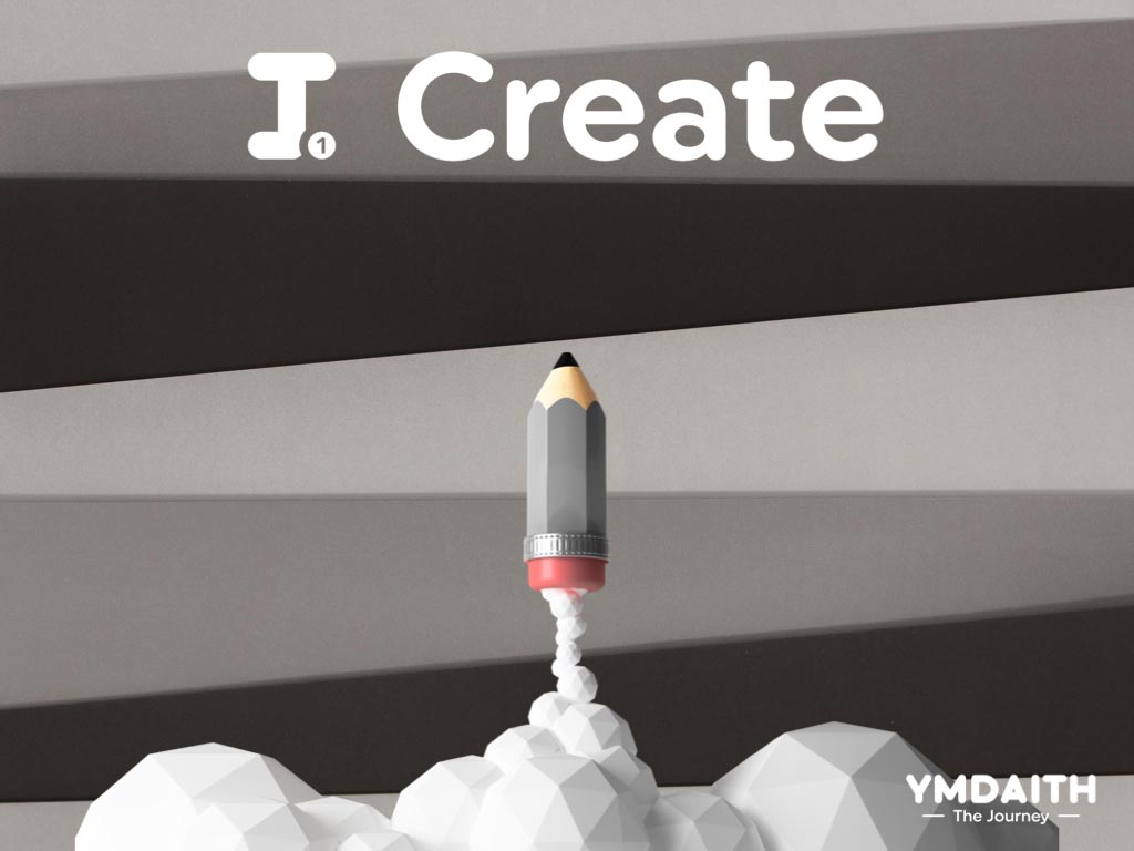
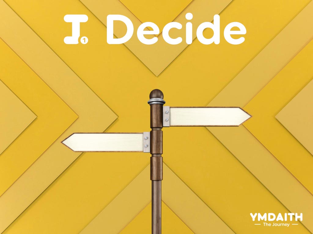
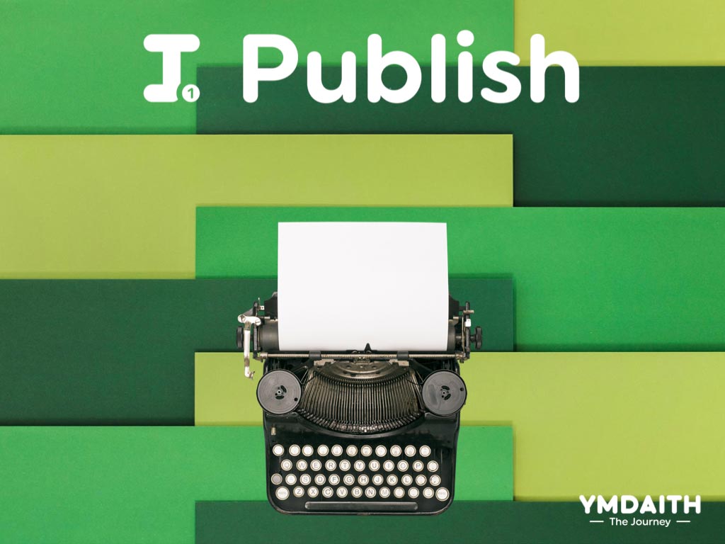
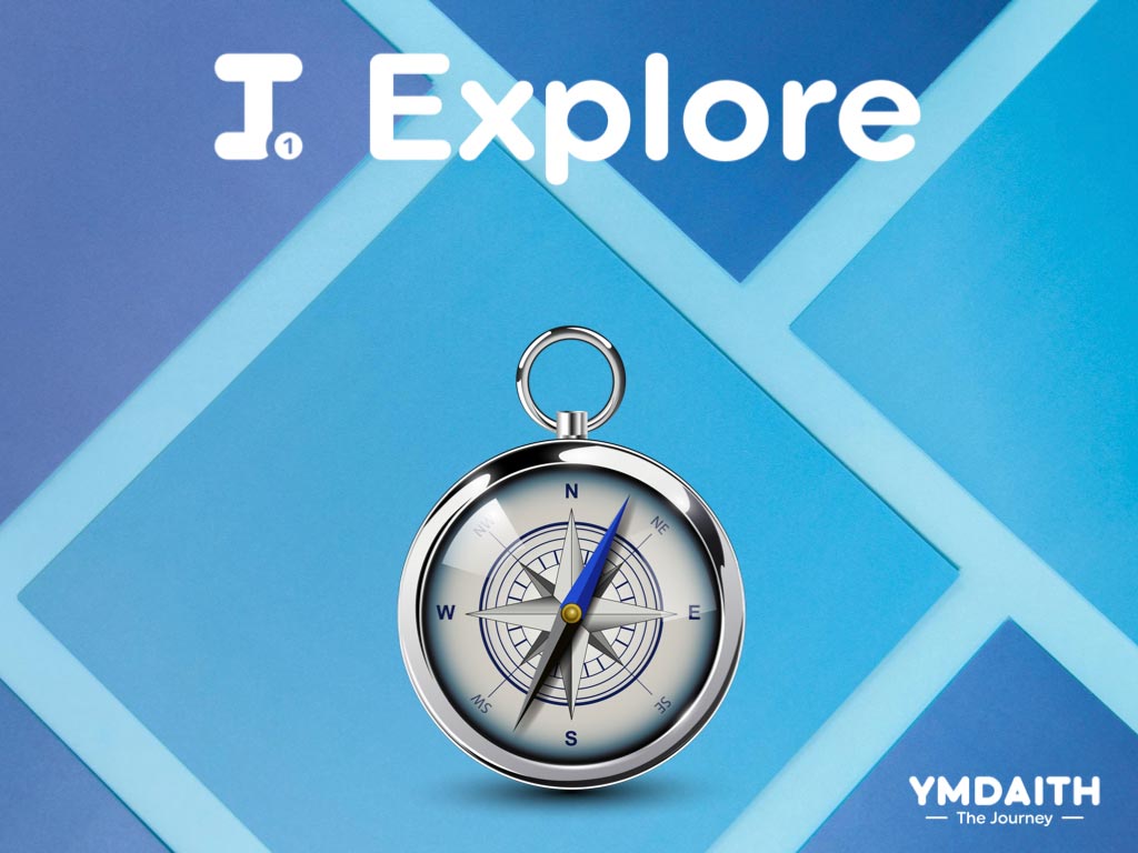
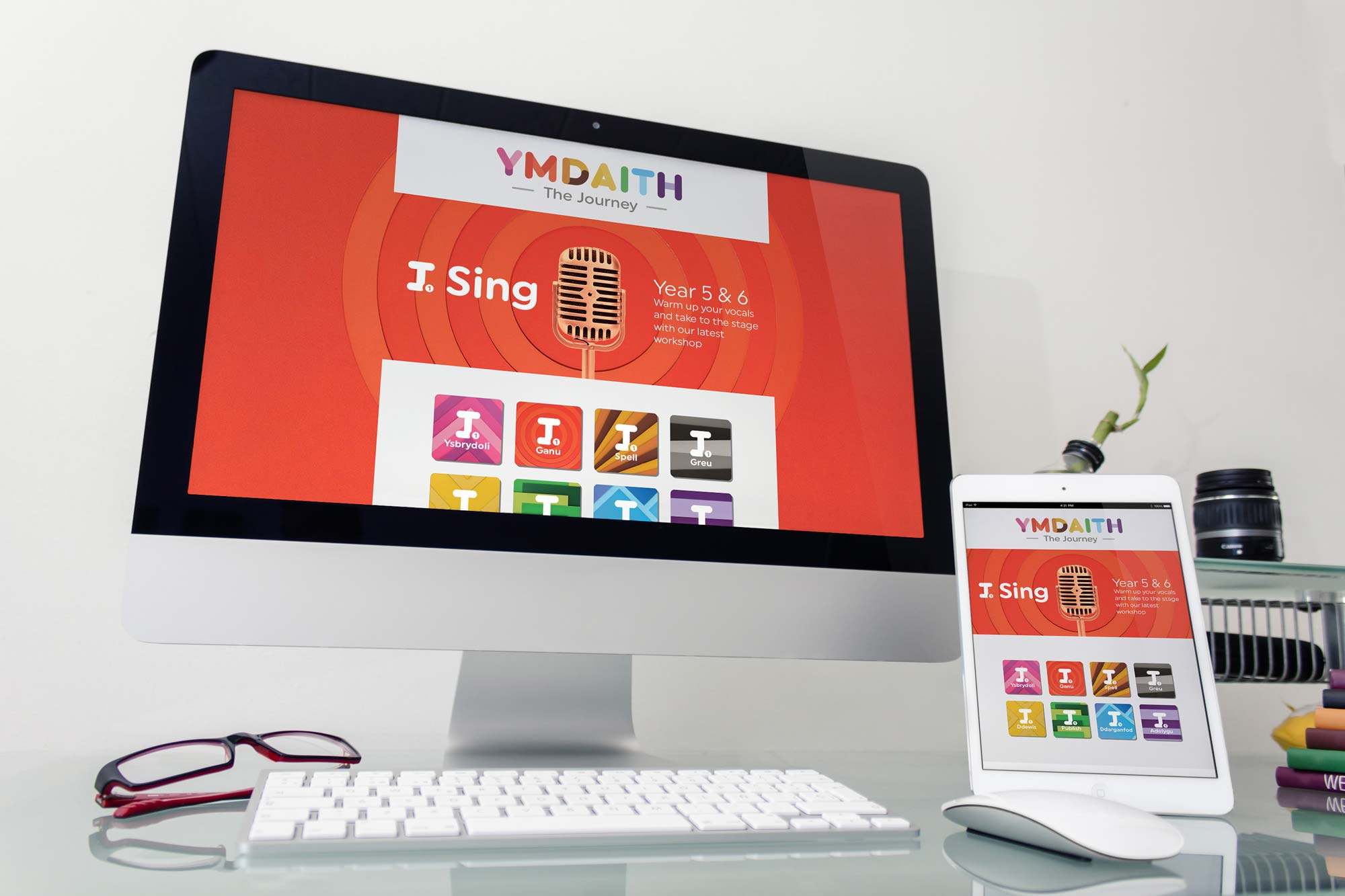
Ymdaith Workshops
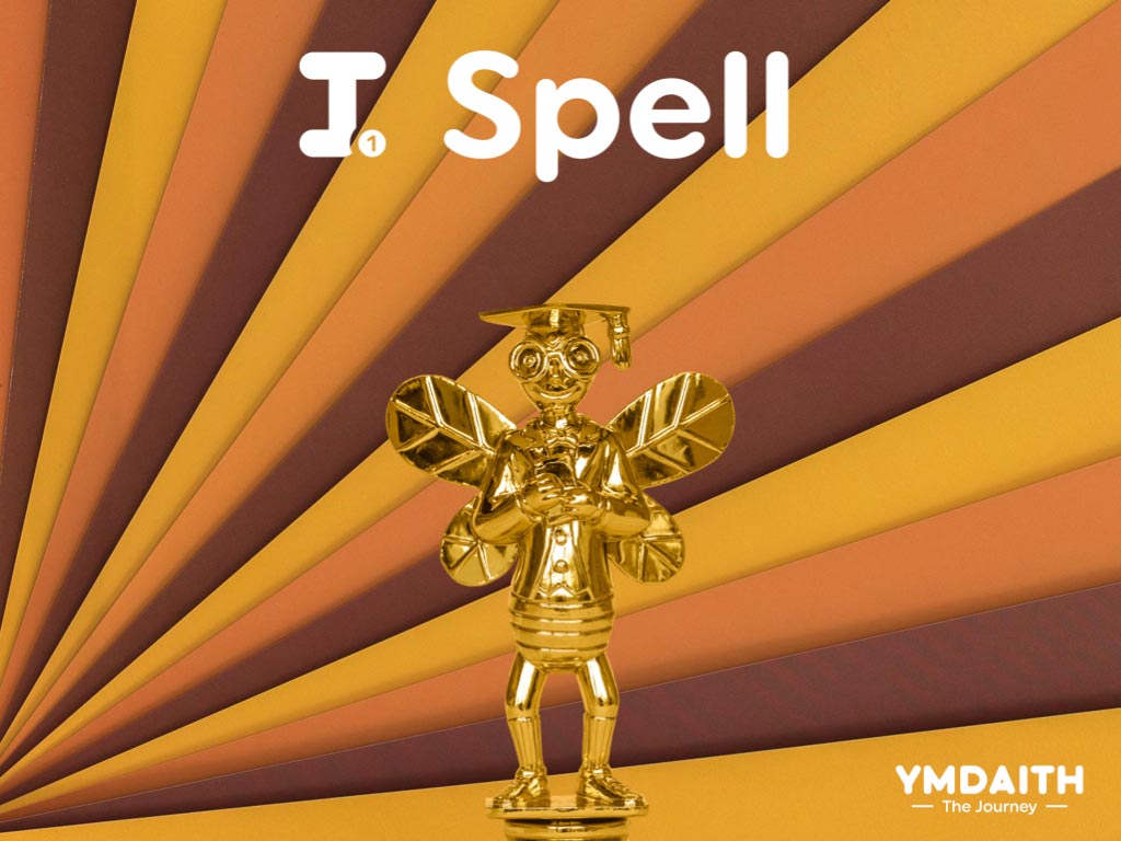
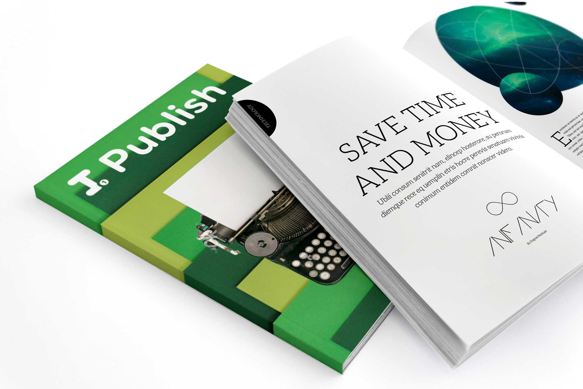
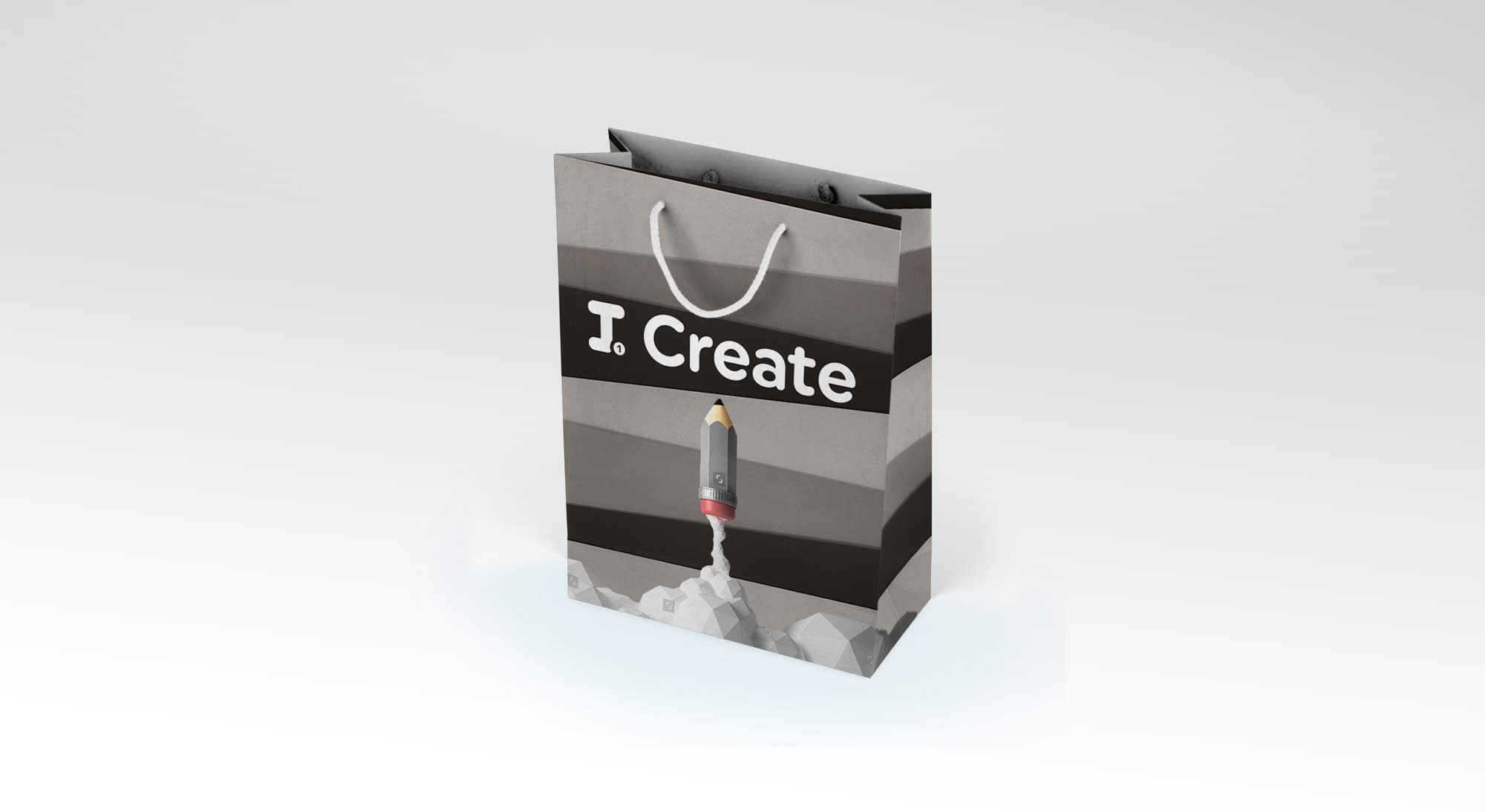
Other than I:Spell, all workshops are conducted in both English and Welsh, and therefore the brand identity required a level of flexibility for translation purposes. We designed the Ymdaith brand so that each workshop has its own identity whilst retaining a clear sense of familiarity within the entire series. Each workshop has its own associated colour, pattern and hero image.
Ymdaith Workshops (English)
Ymdaith Workshops (English)
Ymdaith Workshops (Cymraeg)
Ymdaith Workshops (Cmyraeg)

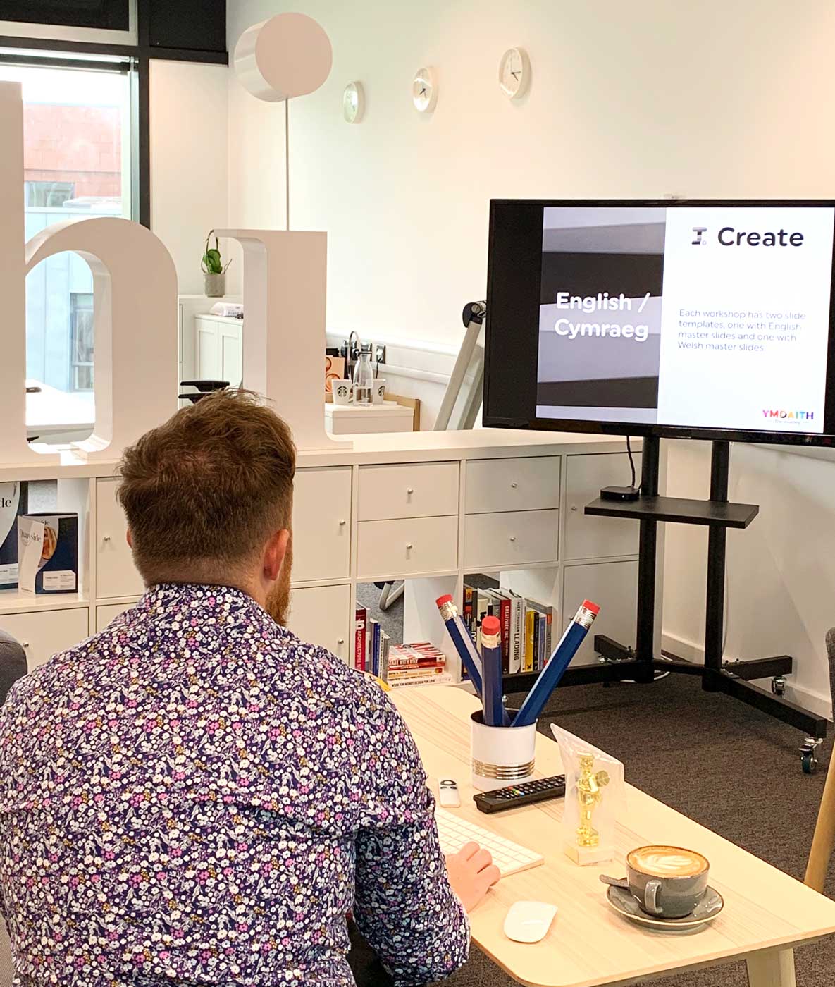
Slideshow Templates
One of the deliverables for this project was the creation of PowerPoint and KeyNote slideshow templates that would enable the client to quickly create on-brand presentations for each workshop.
For each workshop we created 15 master-slide templates, each with 3 variations (one for each Key-Stage, e.g. the logo showing 1, 2 or 3), produced both in English and Welsh.
The final product
A cohesive brand identity for the education sector, showcasing the subject of each workshop whilst inspiring a generation to consider further education … did we get it right? … time will tell. We are however thrilled at how it’s turned out and delighted to see Reaching Wider and the University of Wales Trinity Saint David excitedly put their new brand into action.
The brand identity extends to allow each workshop to adapt to either Key-Stage 1, Key-Stage 2 or Key-Stage 3 pupils.
Another fantastic I:Spell competition was held last week at @UWTSD with #YsgolHarriTudur taking the trophy home. Congratulations to Megan, Maddy, Anna, Carys and Jess for winning this year's competition! Well deserved! #ReachingWider #Spelling #Literacy #Year7 #Language pic.twitter.com/ooMyAfmgZA
— Reaching Wider UWTSD (@ymdaith) July 23, 2019
A fantastic day with pupils from @TrallwnPrimary today. Fantastic to see so many of them inspired about their future aspirations. Good luck to them all in the future! #TheNextGeneration #RaisingAspirations @UWTSD @StudyUWTSD @uwtsd_soe pic.twitter.com/4zlANGDSbw
— Reaching Wider UWTSD (@ymdaith) July 2, 2019
Behind the scenes
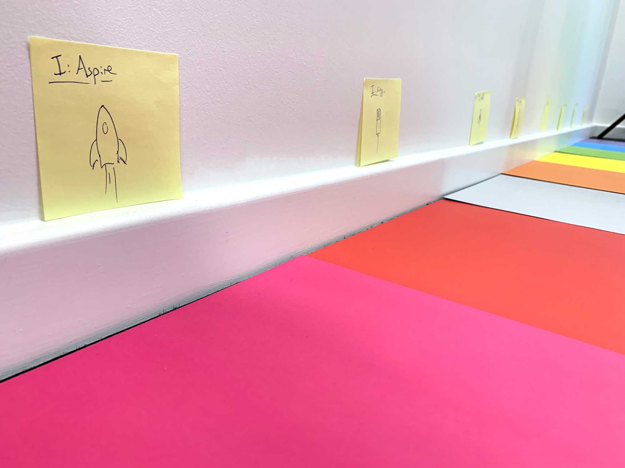
We enjoyed the process of crafting Ymdaith so much, we couldn’t hold back from showing you how it was made.
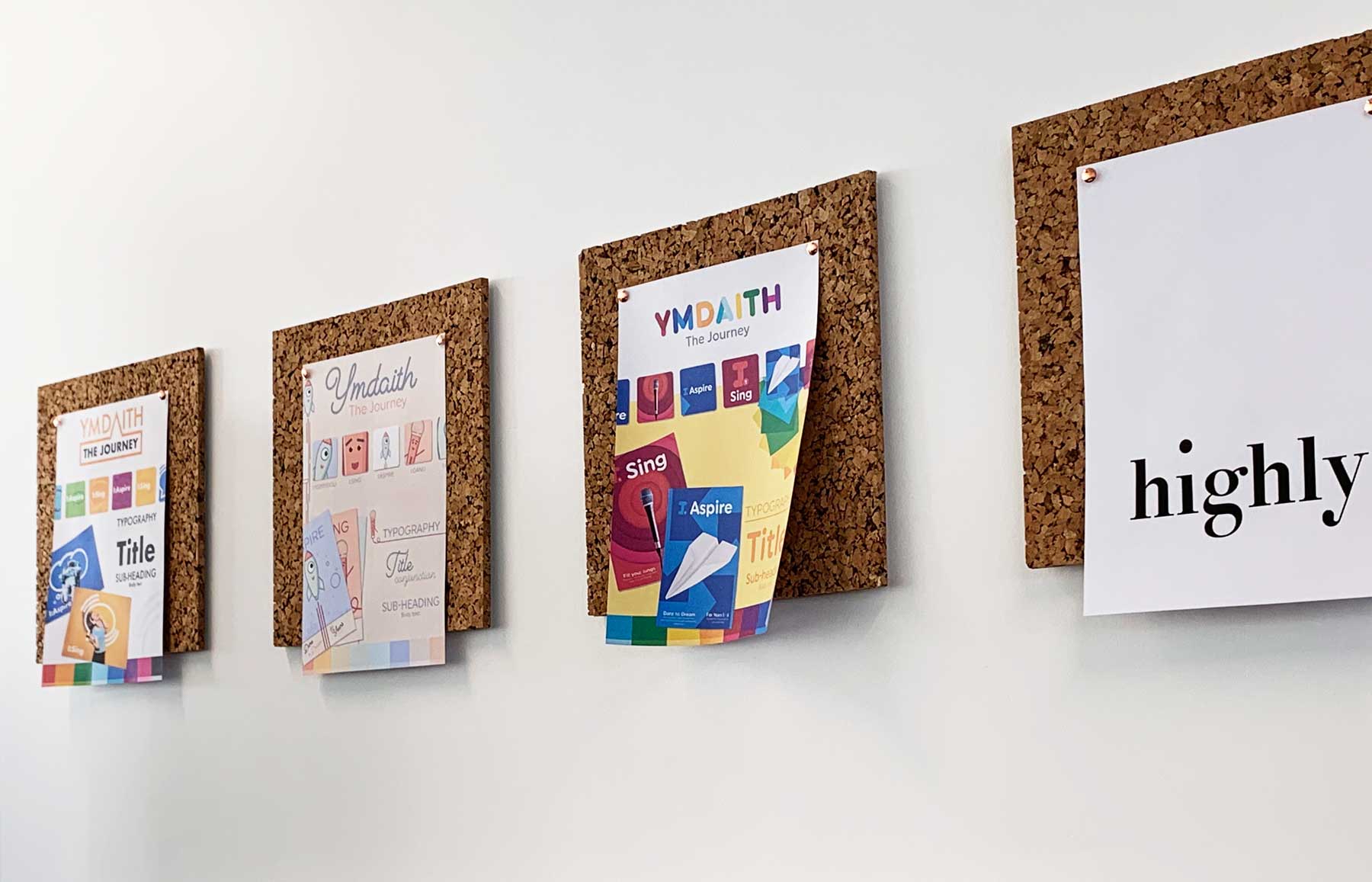
Concept presentation
Following the initial consultations and strategy, Highly proposed a number of design directions.
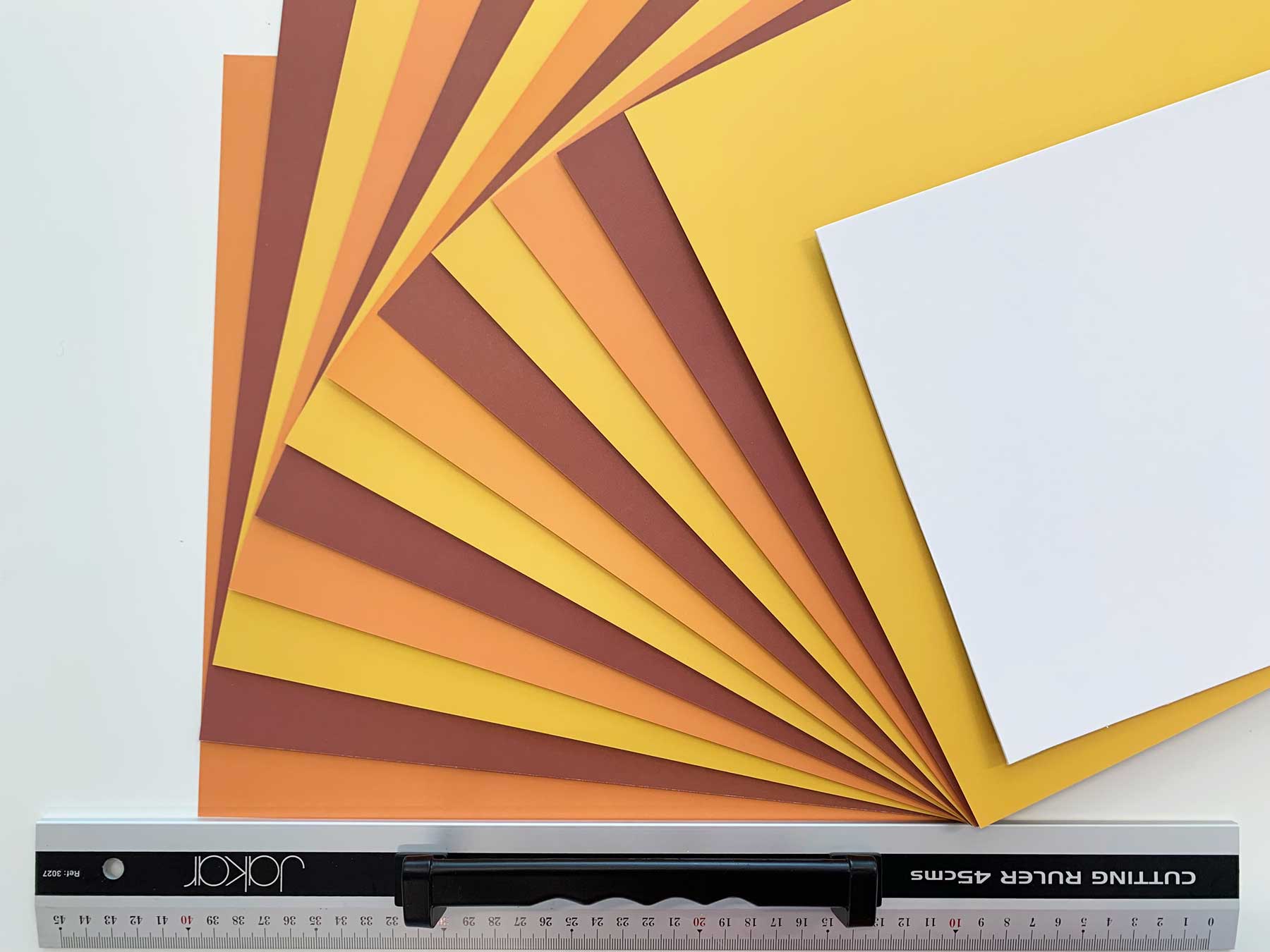
Hand-crafted artwork
Watch the video and take a look at the images below showing how we designed and hand-crafted the imagery for the Ymdaith brand identity.
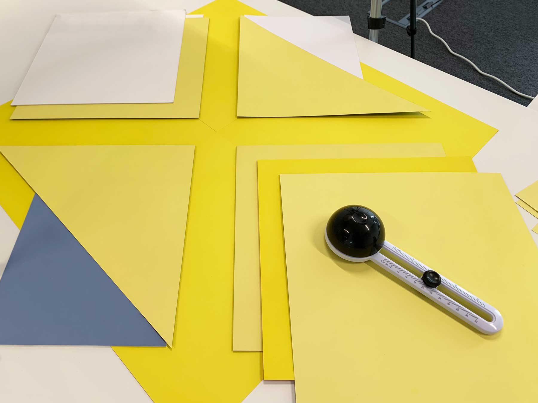
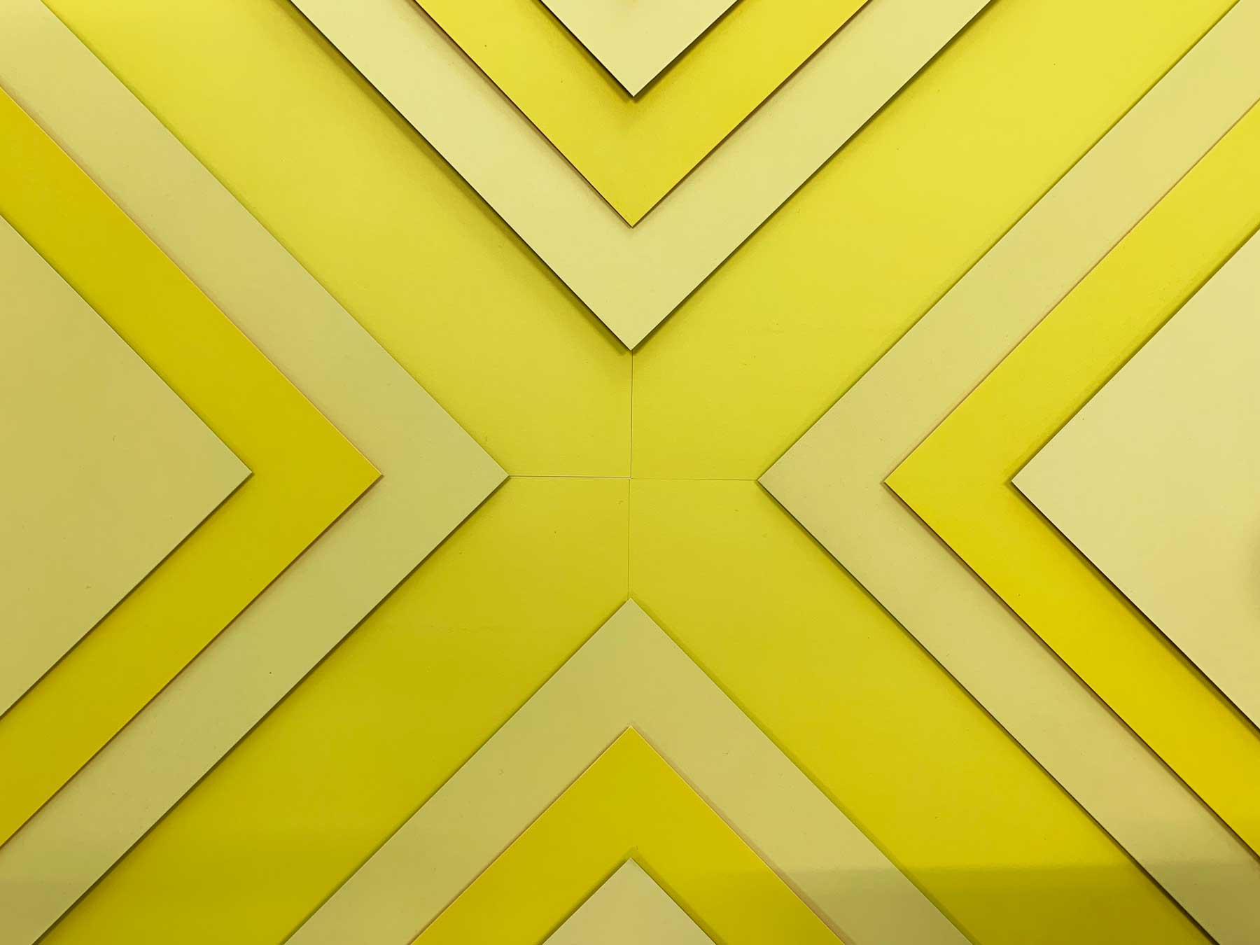
Precision work
In order to achieve a high level of professionalism, each layer of paper was cut and painstakingly laid-out with precision. Every millimetre and degree of separation counted here. Each piece of coloured paper was separated with card to give a perception of depth and add texture through shadows created by the separation.
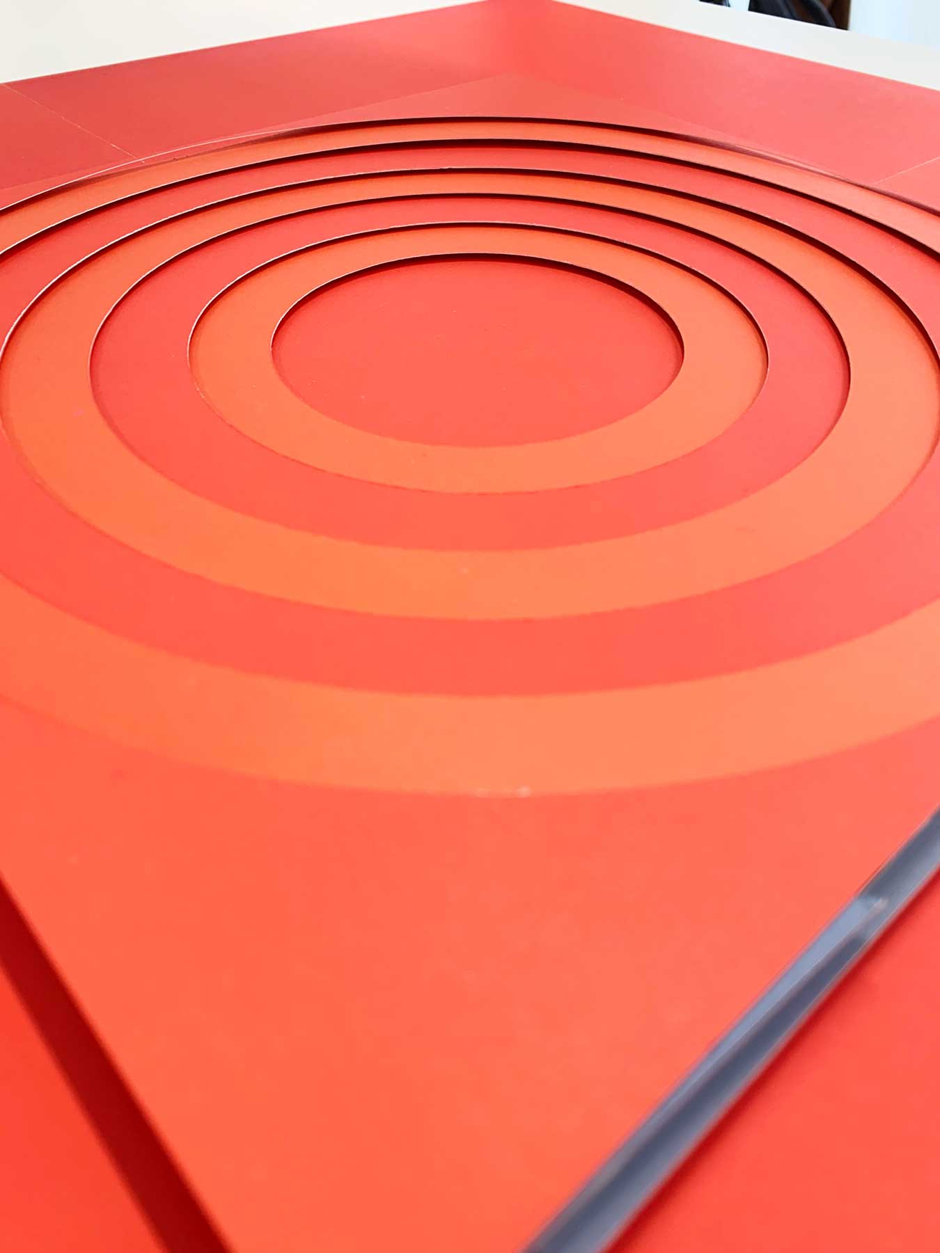
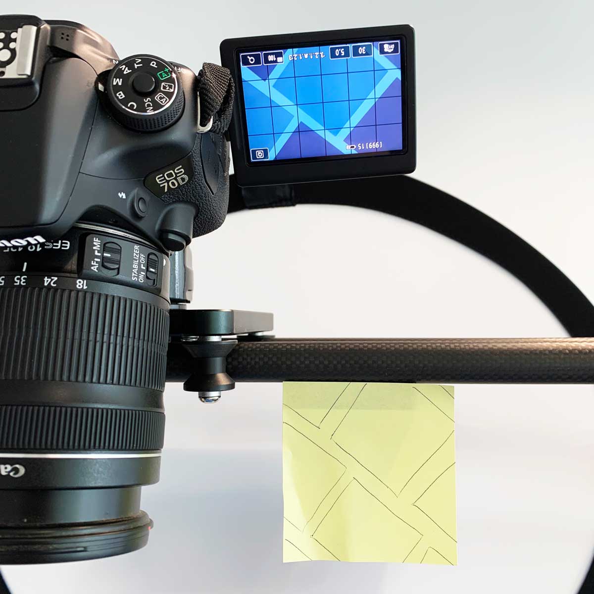
Photography
We adapted the Highly studio into a photography studio, diffusing the natural light from the windows and mounting a diffused LED light panel to cast the shadows.
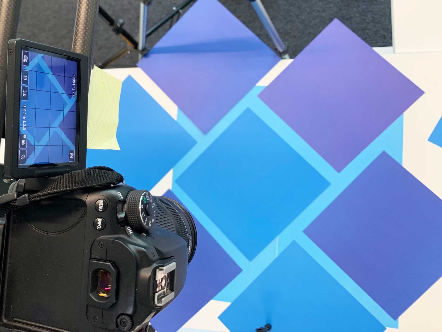
Creating the digital artwork
You can see below the process of how we created the I:Decide artwork from layering coloured paper, capturing the overhead photograph, editing in Photoshop and finally using the image within the context of I:Decide brand elements.

Ryan Peters (left pic & right in right pic) of Reaching Wider & University of Wales Trinity Saint David with Highly’s Managing Director, Daniel Patterson at the final presentation of Ymdaith.
Ryan Peters
UWTSD - South west wales reaching wider partnershipThe level of thought and detail behind the bilingual branding is impressive. The designs are fresh and exciting. Daniel understood the brief and communicated regularly throughout the process with updates and previews.
I would highly recommend Highly to anyone looking for an exceptional graphic design company to assist with their needs.
Thank you Daniel! Diolch o galon!“