Highly RELAXING
Quayside Orthodontics – S.W. Wales
Orthodontist Branding
Industry
Health & Wellbeing
Health & Beauty
Services
Brand Strategy
Naming
Brand Identity (& logo) Design
Website Design & Build
Signage & Environmental Design
Marketing & Print Collateral
Visit
Brand identity & logo design
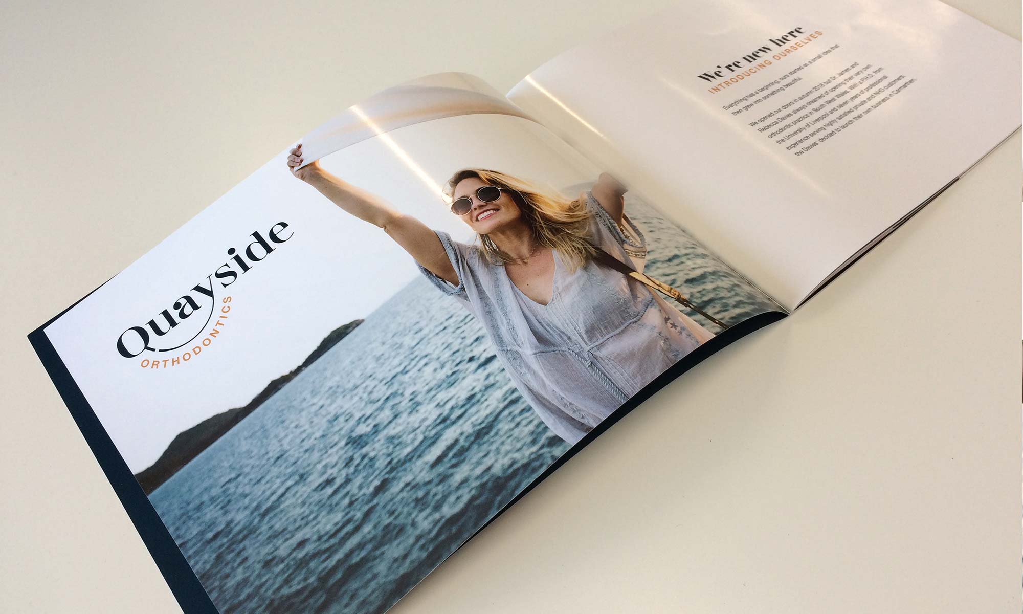
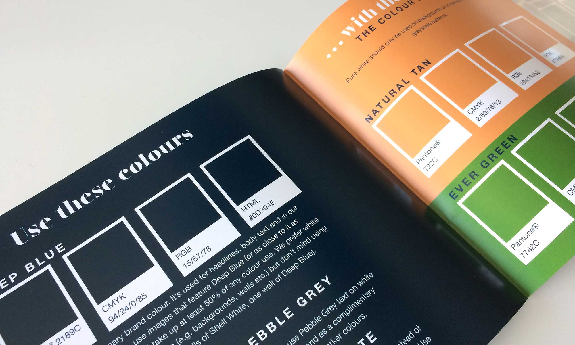
The brand identity encapsulates a tranquil, peaceful feel with a distinctive colour palette which contrasts the sea of other dental practices that are usually clinical, cold and sterile.
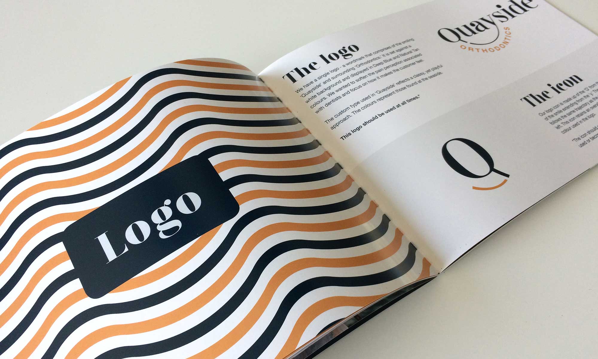
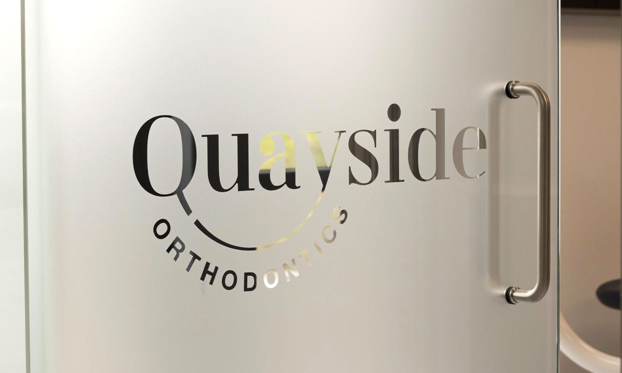
The logo showcases a subtle smile joining the ‘Q’ to the ‘y’ in ‘Quayside’. As with the brand identity as a whole, we purposefully stayed away from explicitly showing teeth or dental procedures, which only add to the stress of a visit.
A branding styleguide was created for Quayside Orthodontics’ communications. It showcases best practices for how to aspects of the brand identity such as typography, tone-of-voice, the logo, colours, photography style, layout etc.
Website & Marketing collateral design
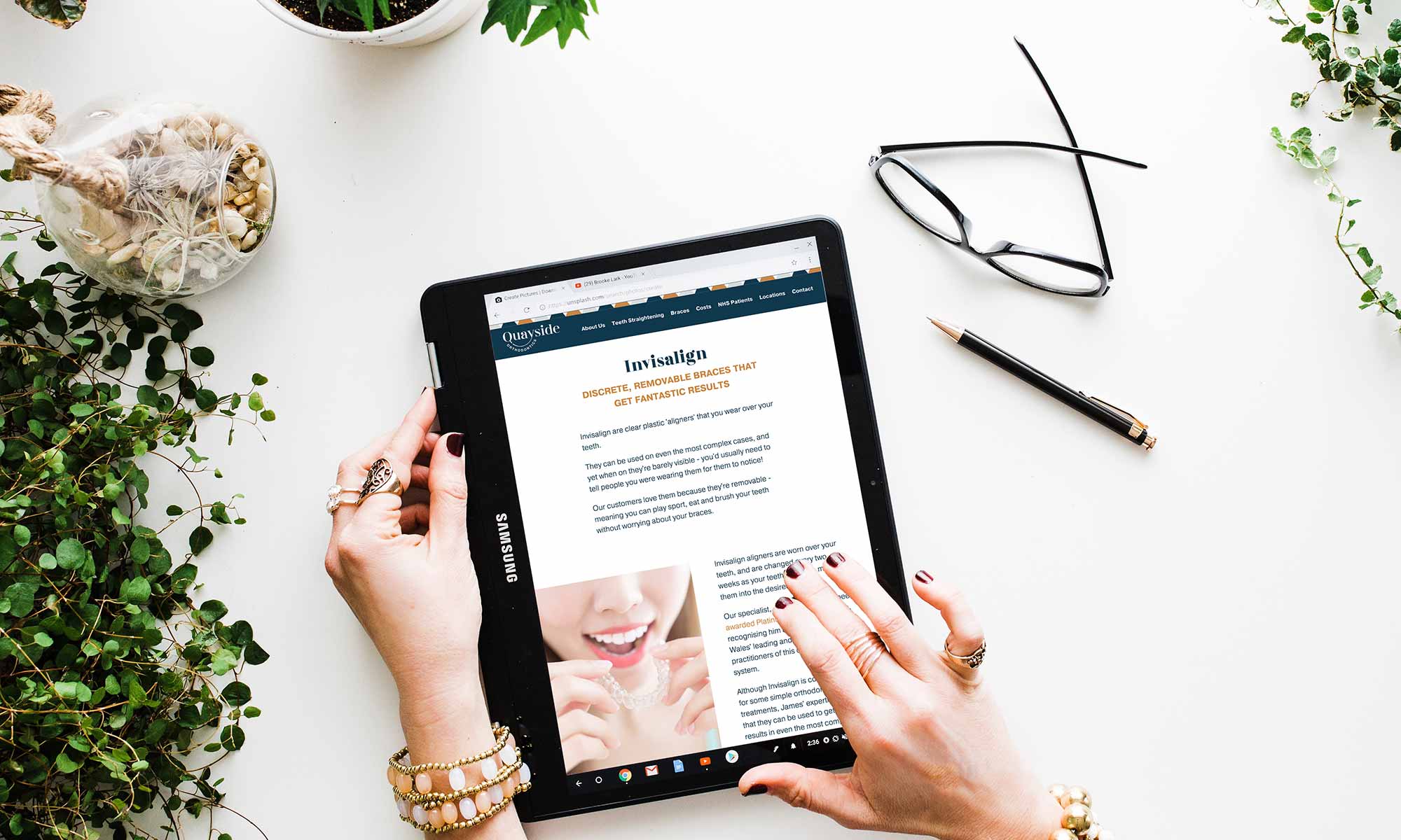
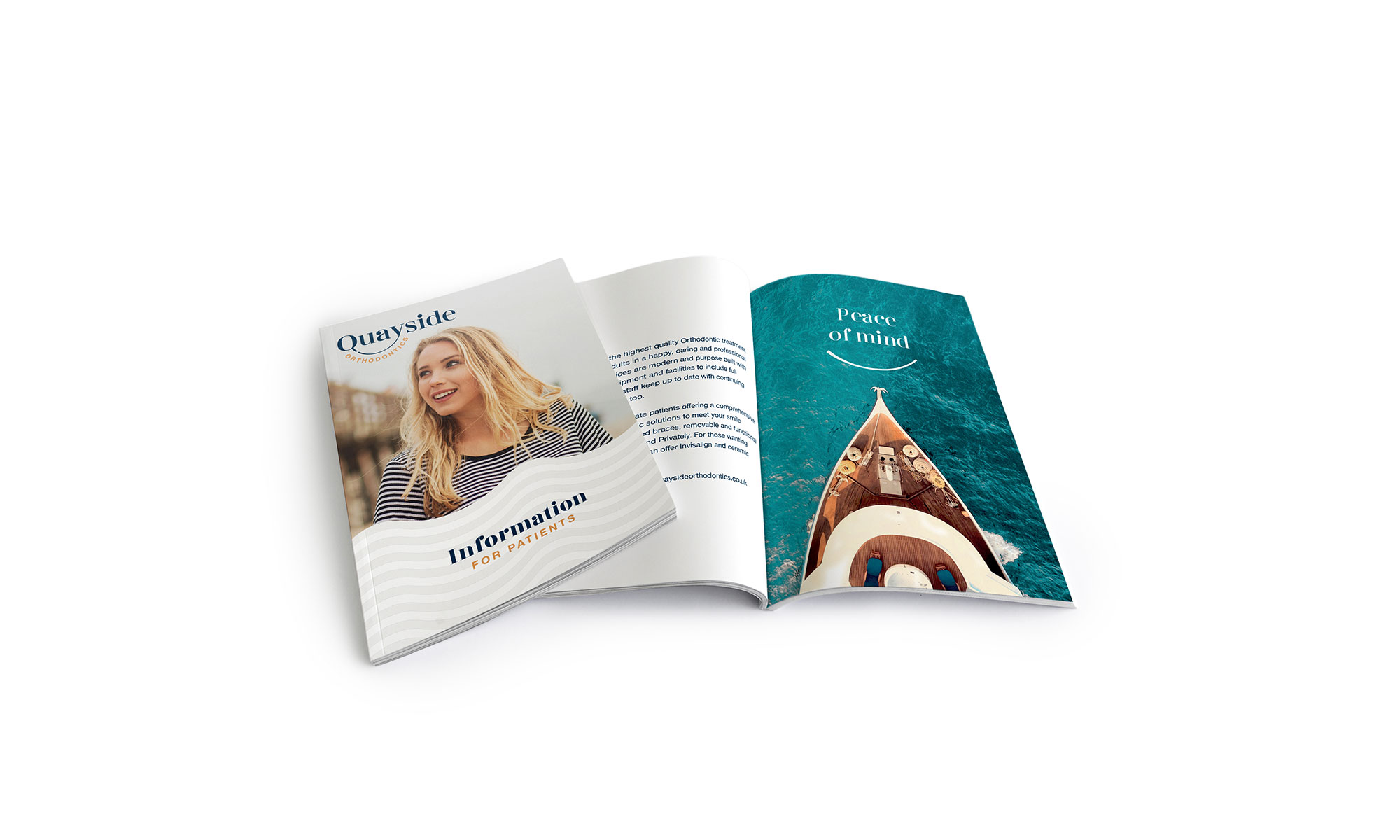
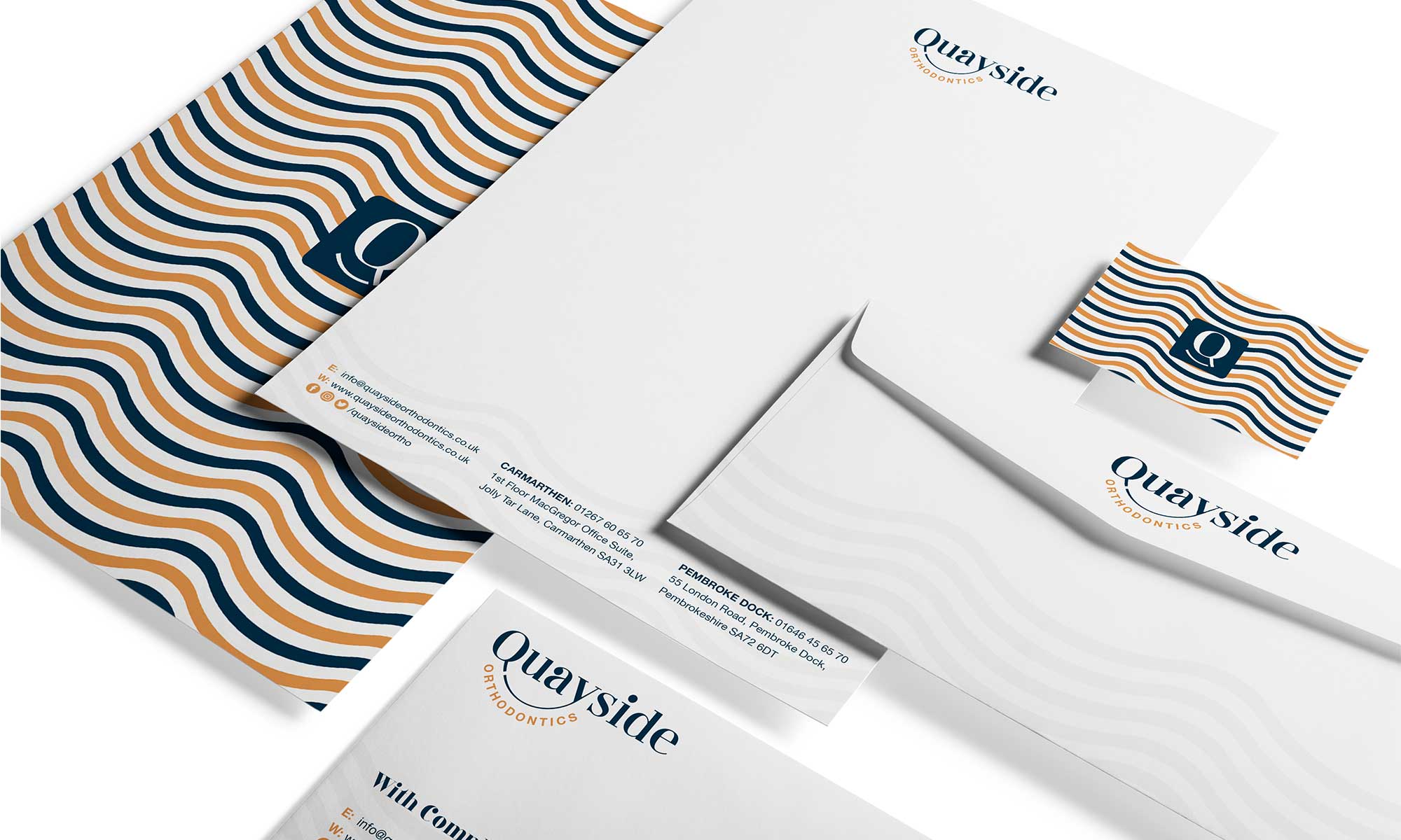
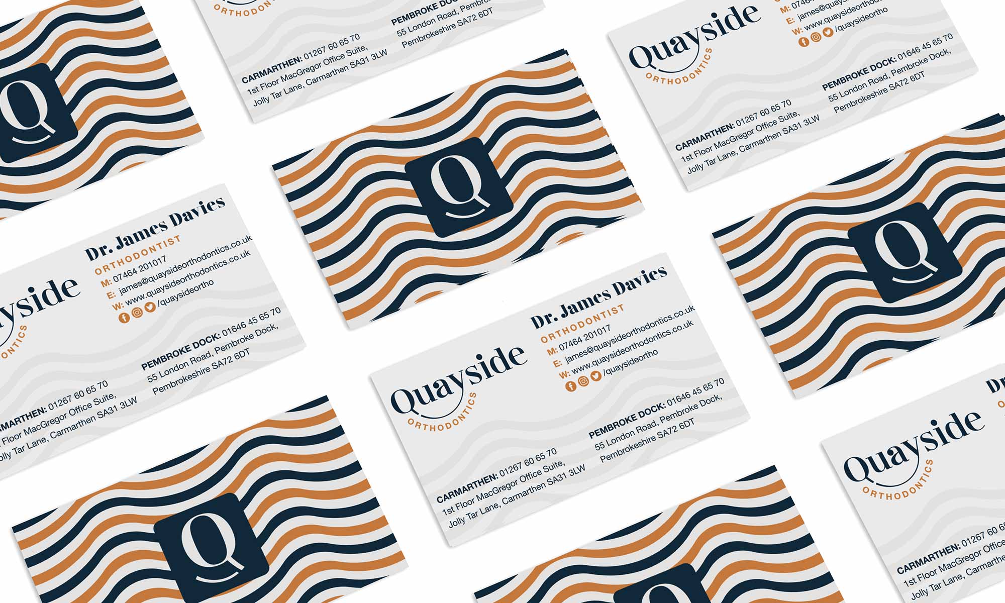
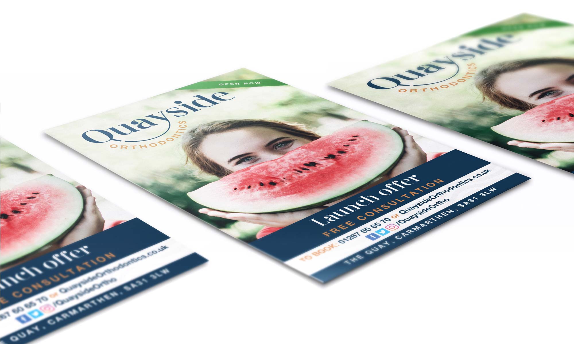
Following the creation of the brand identity, Highly were instructed to implement the design. We designed and developed their new orthodontist website along with other marketing collateral such as referral packs, patient information brochures, business stationery and advertising items like posters and flyers.
The tranquil seaside theme is used within various items to support a calm and relaxing vibe.


Interior & environmental design
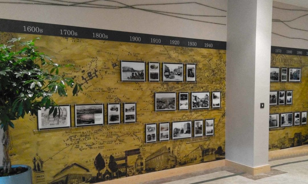
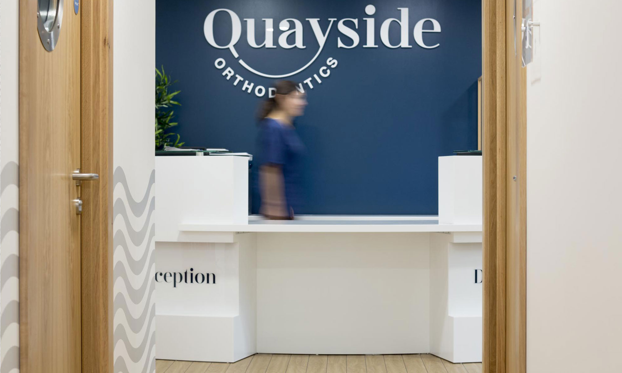
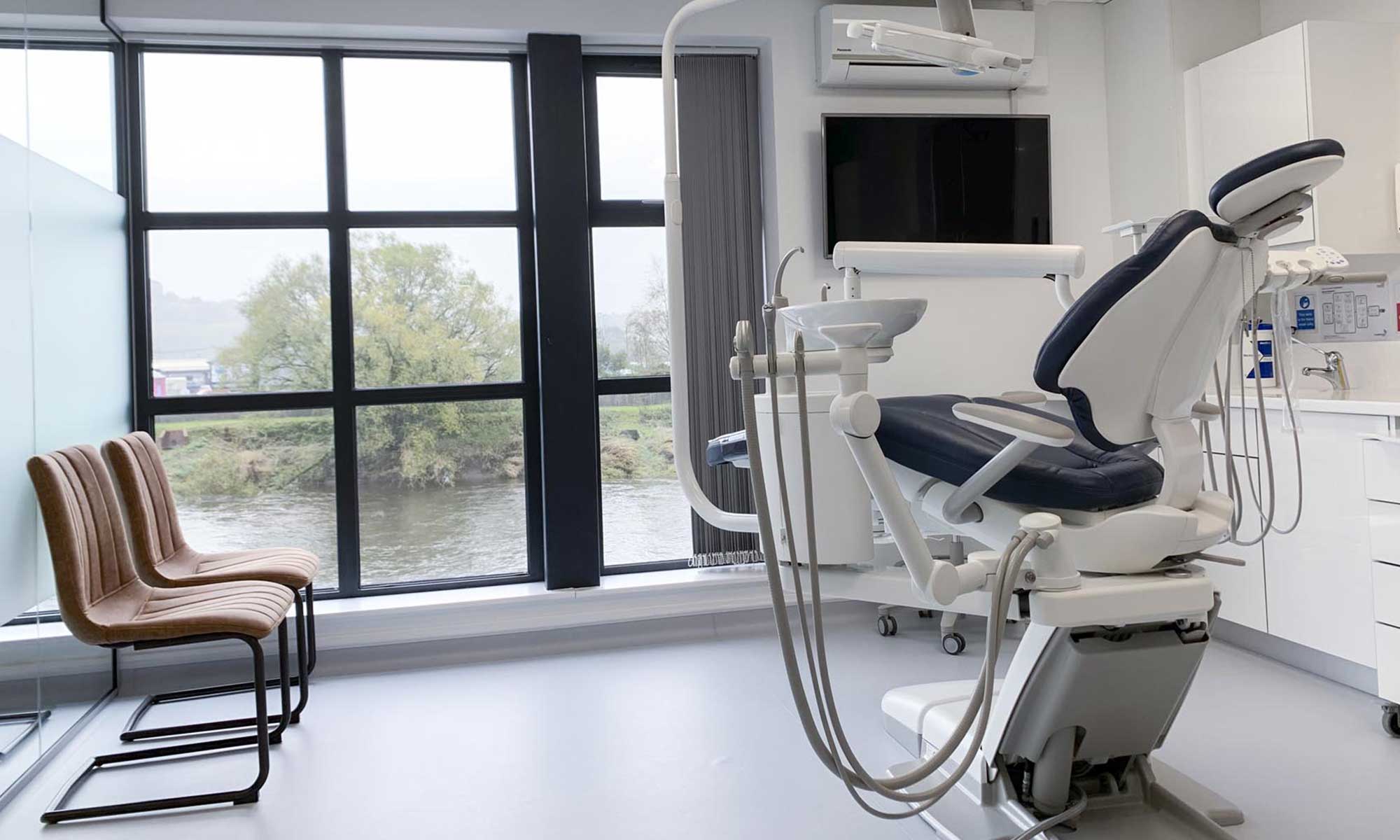
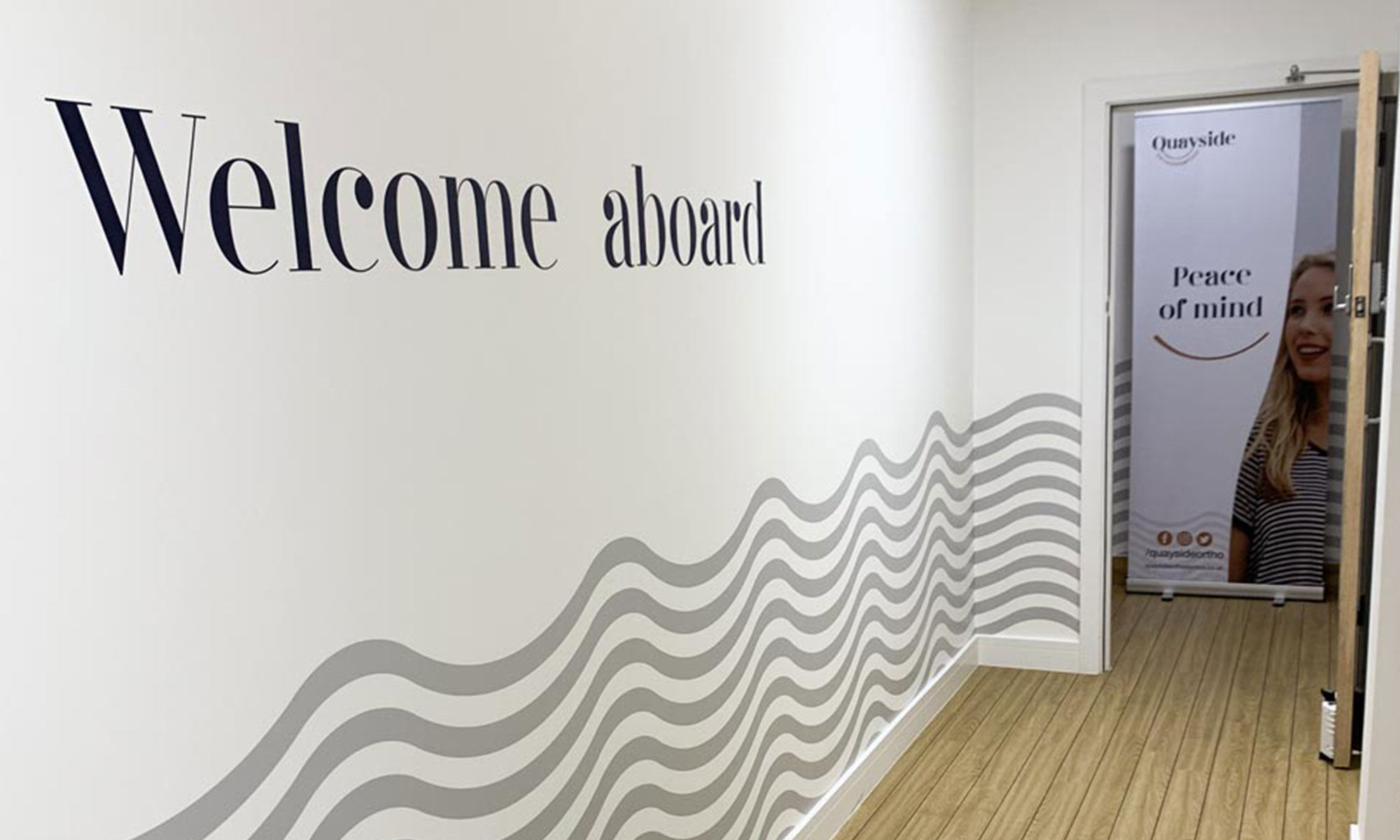
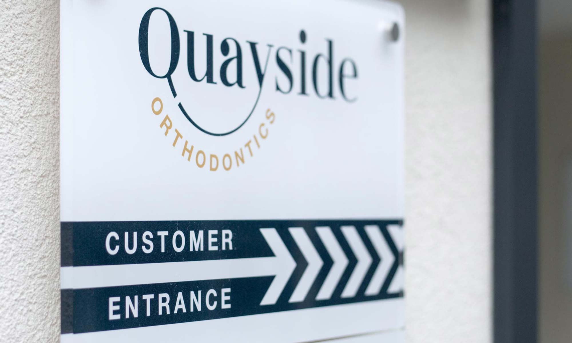
Highly worked with the team at Decadent to design the interior spaces, extending the brand identity throughout the visitor experience. As well as creating interior and exterior signage, the waves pattern was applied to the interior walls. Everything from furniture, the deck-flooring to the doors with port-hole windows were carefully designed to create a sense of wow.
On your next visit to Quayside Orthodontics, you might even notice that the Deep Blue walls all face towards the reception. Subtleties that showcase Quayside Orthodontics’ attention to detail.
Dr. James Davies
Quayside Orthodontics, Founder & Principal Orthodontist“Working with the experienced team at Highly has been fundamental to the success of Quayside Orthodontics as a start-up business. Daniel Patterson held our hand through the creative brand strategy process, from offering a plethora of naming options to completing our vision for the practice.
The service from Highly is professional and attention to detail is applied to every stage of our project. Our ideas were always considered and included. The quality of Quayside Orthodontics branding has enabled us to compete with the best and win contracts. Our partnership with Highly has been instrumental to the profitability of our business. We look forward to working with the team in the future.“

