Highly Adventurous
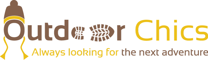
Outdoor Chics – UK
Always looking for the next adventure
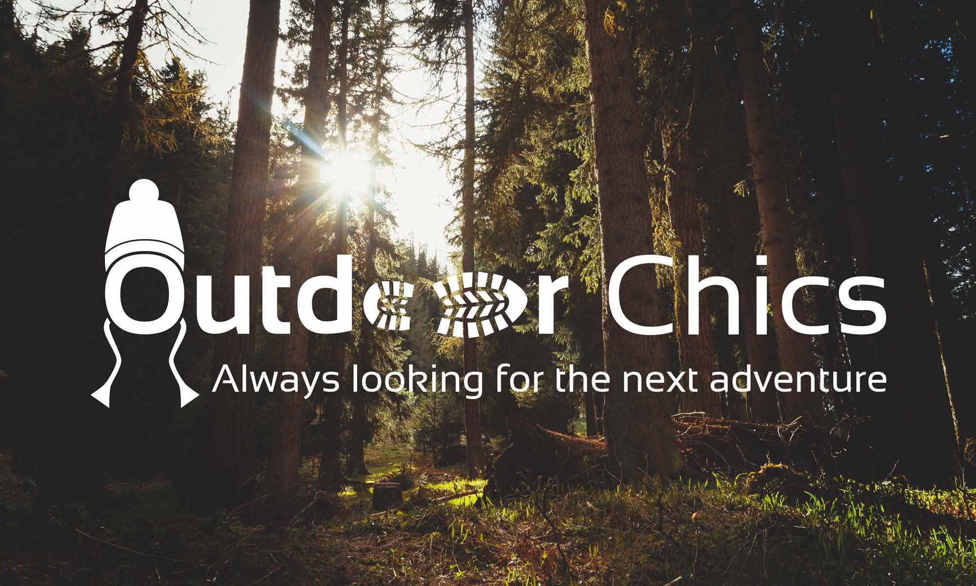
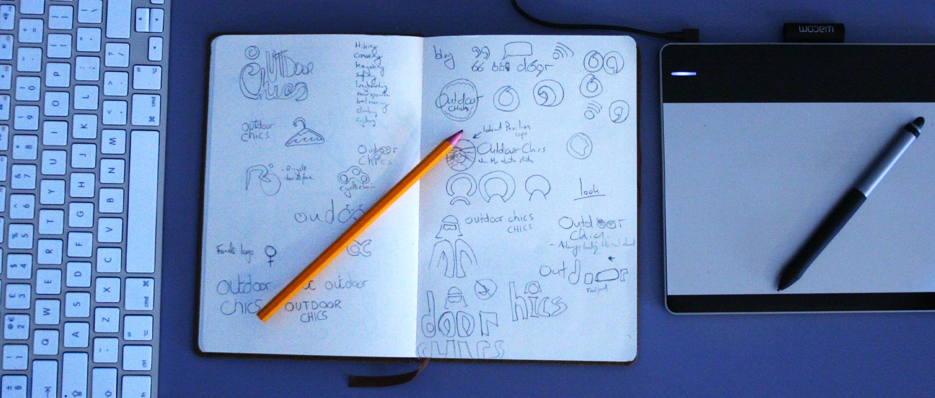
When Margaux Doey was ready to launch her outdoor adventure blog for women, she got in touch with Daniel to design the Outdoor Chics logo. The goal was to create an image that would portray the feminine brand yet retain a sense of ruggedness associated with outdoor activities.
Case Study
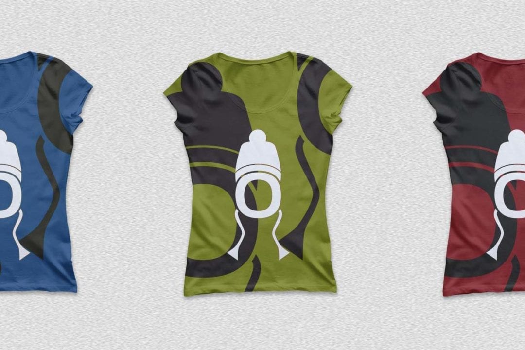
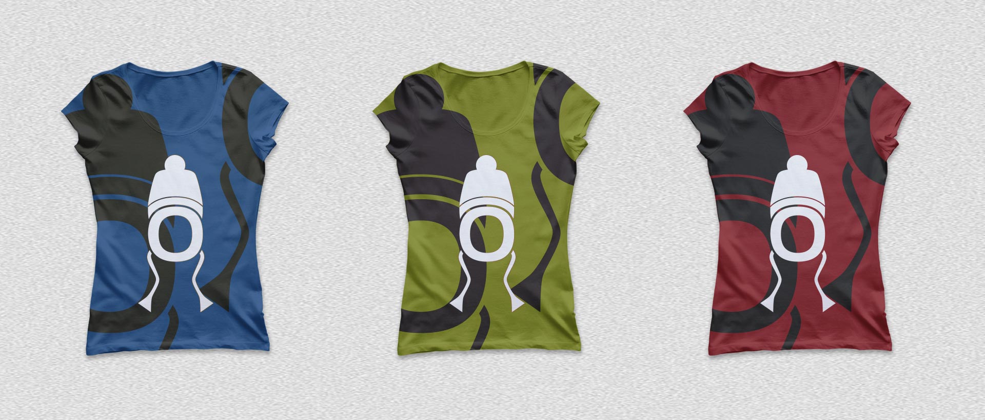
With a growing UK and international audience, Outdoor Chics needed to stand out from similarly focused blogs. Whilst the brand covers all manners of outdoor sports, it would simply have been visually overwhelming to included all aspects of outdoor sports or activities in the logo. So we decided to ditch all the cliché imagery (mountains, surfboards, sea waves etc.) and focus our ideas on an inclusive logo that would relate to its female audience yet still represent the outdoors. The final deliverables included the logo mark in both portrait and landscape orientations and the ‘O-hat’ icon.
Visual Concept
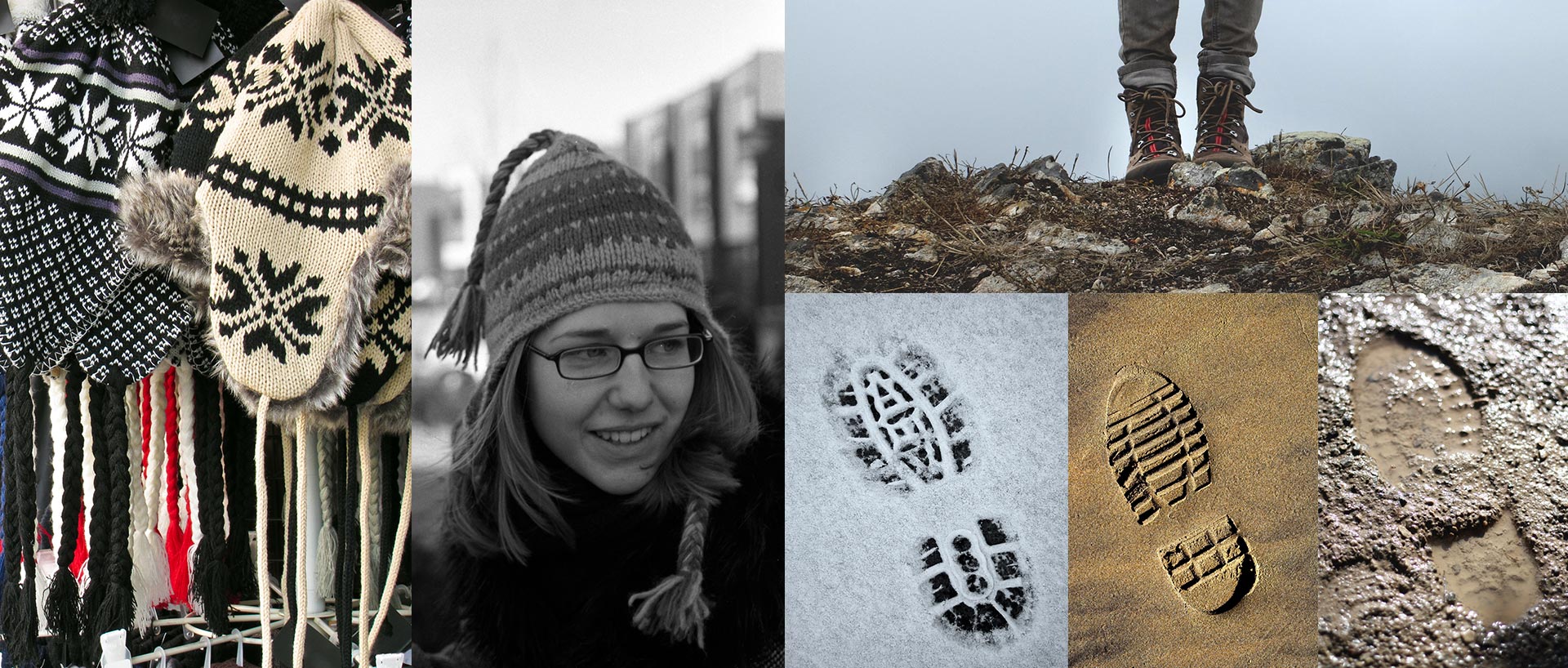
Inspiration for the Outdoor Chics logo came from common aspects of being active outdoors. The bonnet beanie hat with strings added a feminine touch to the visual flavour. It is wrapped around the ‘O’ from Outdoor which portrays the ‘O’ as a face. The ‘oo’ in outdoors was created using the concept of a boot-print in the snow/sand/mud.
Colour
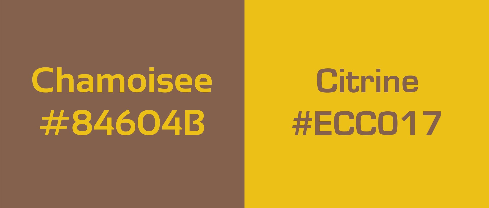
The colour scheme moved from an initial request to use a specific shade of green to using ‘earthy’ colours. The final colour combination chosen was Chamoisse brown for the ‘Outdoor’ text and Citrine yellow for the beanie hat features and the ‘Chics’ text.
Margaux Doey
Outdoor Chics, Founder & Journalist“Daniel was able to offer me 3 beautiful logo design options to choose from. He worked quickly and professionally and really went above and beyond to make sure I was happy. Would highly recommend him!“