Highly Luxurious
E-Beauty – Cardiff, Wales
Health & Beauty Supplements for Millennials
As featured in Cosmopolitan, Vogue, Elle, GQ & other publications.
UK-based nutrition and supplements company, eBeauty Ltd., commissioned us to disrupt the ‘clinical’ nature of the industry by designing a new vitamins & botanicals brand for the young-adults market.
Industry
E-Commerce
Health & Beauty
Services
Brand Strategy
Brand & Product Naming
Logo Design
Brand Identity Design
Packaging Design
Web Design
Training & Support
Visit
CASE STUDY
Following the success of two other brands in their sector, eBeauty engaged us at the very beginning of their third brand’s journey.
We started with a Discovery session where a brand strategy was developed and identified a clear direction for moving forward. Together we established an initial product range, target audience, and route-to-market.
Initial Research
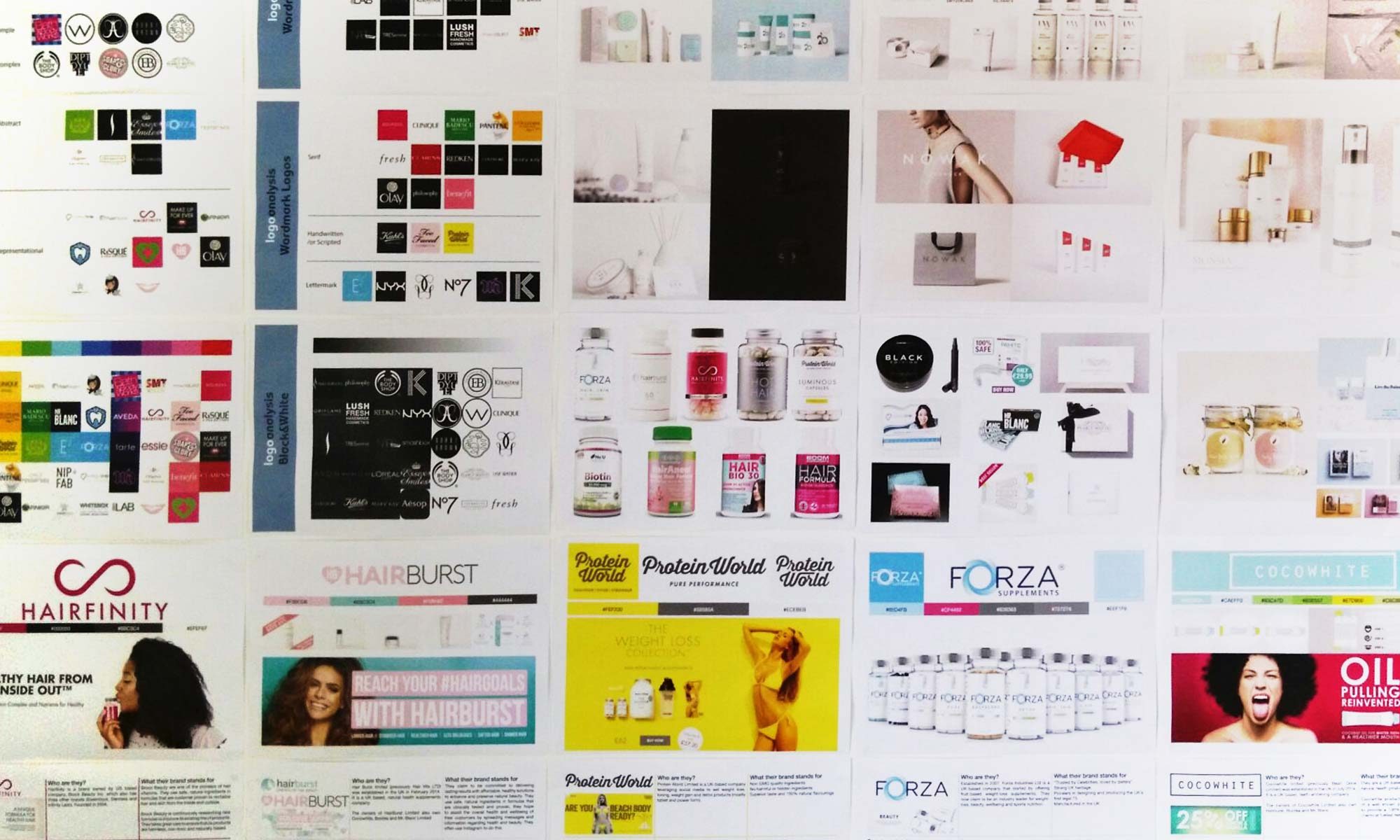
Aspirations for the brand take them beyond the UK into other world markets. We therefore studied and analysed potential competition and market opportunities in Europe, USA, the Middle East and Australia.
Naming
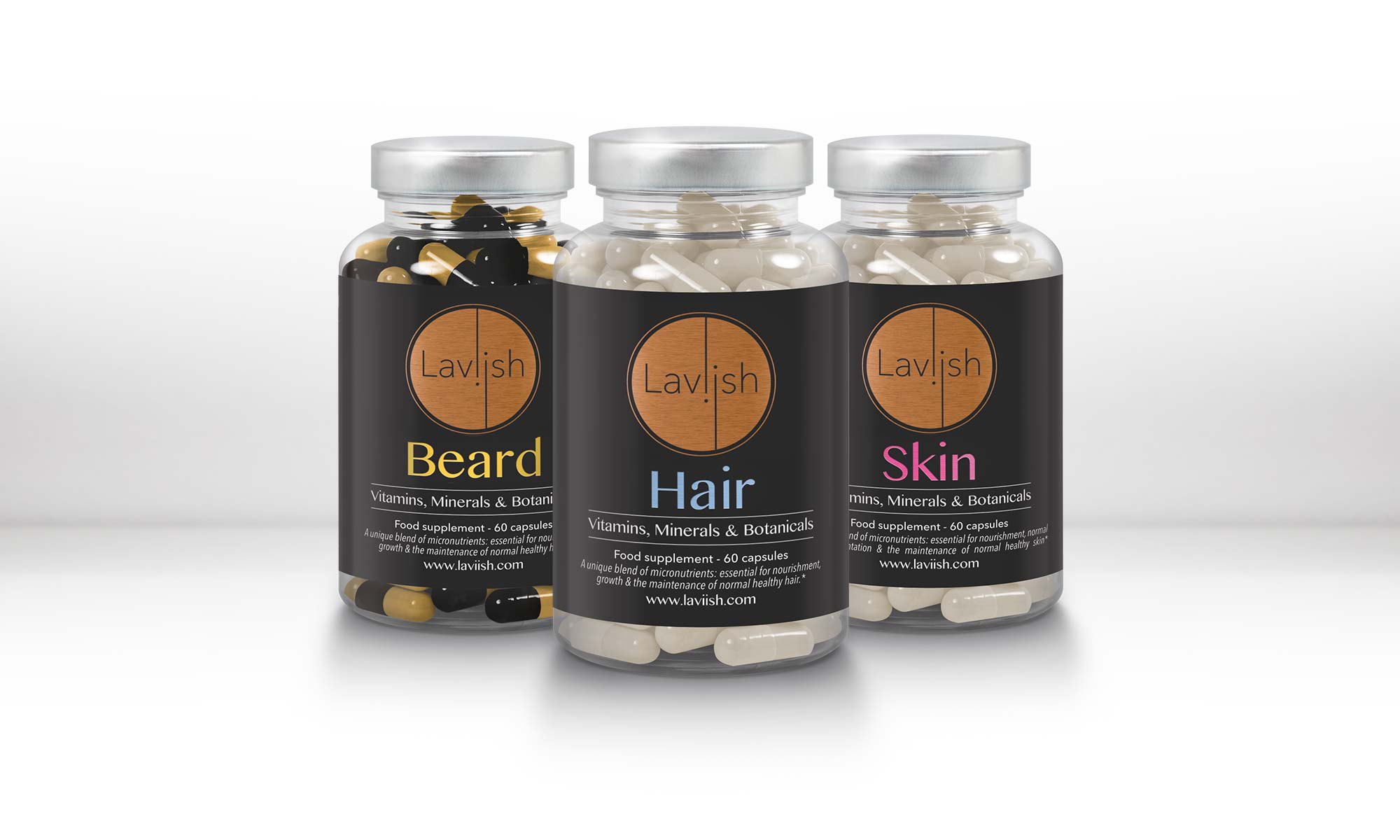
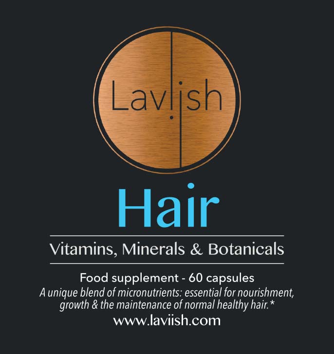
Following several consultations and through careful deliberation, the team at eBeauty quickly settled on a new name for their new brand. “Laviish®” was birthed – this luxurious name would set the tone for product quality, place it in the high-end of the market and also allow the brand to carry its name across other interaction avenues such as their .com domain name, www.laviish.com.
The placement of the logo with the brand name immediately under it leads the consumer to read both together. This was intentionally designed with the Laviish® product range so their brand name would become an integral part of the product name itself.
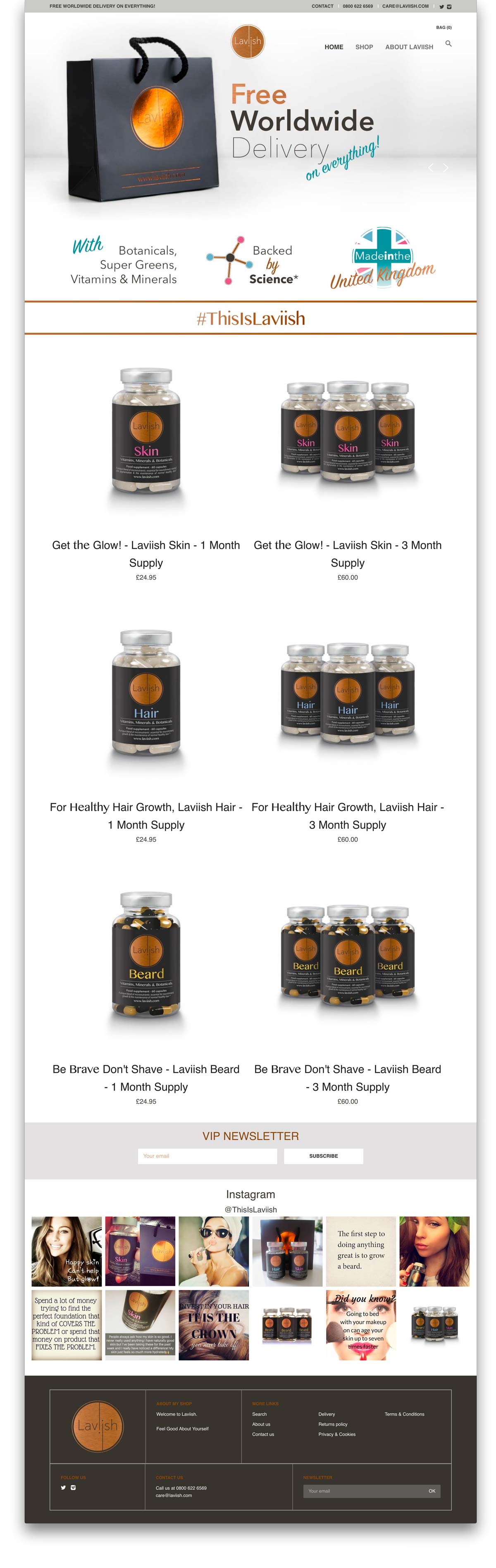
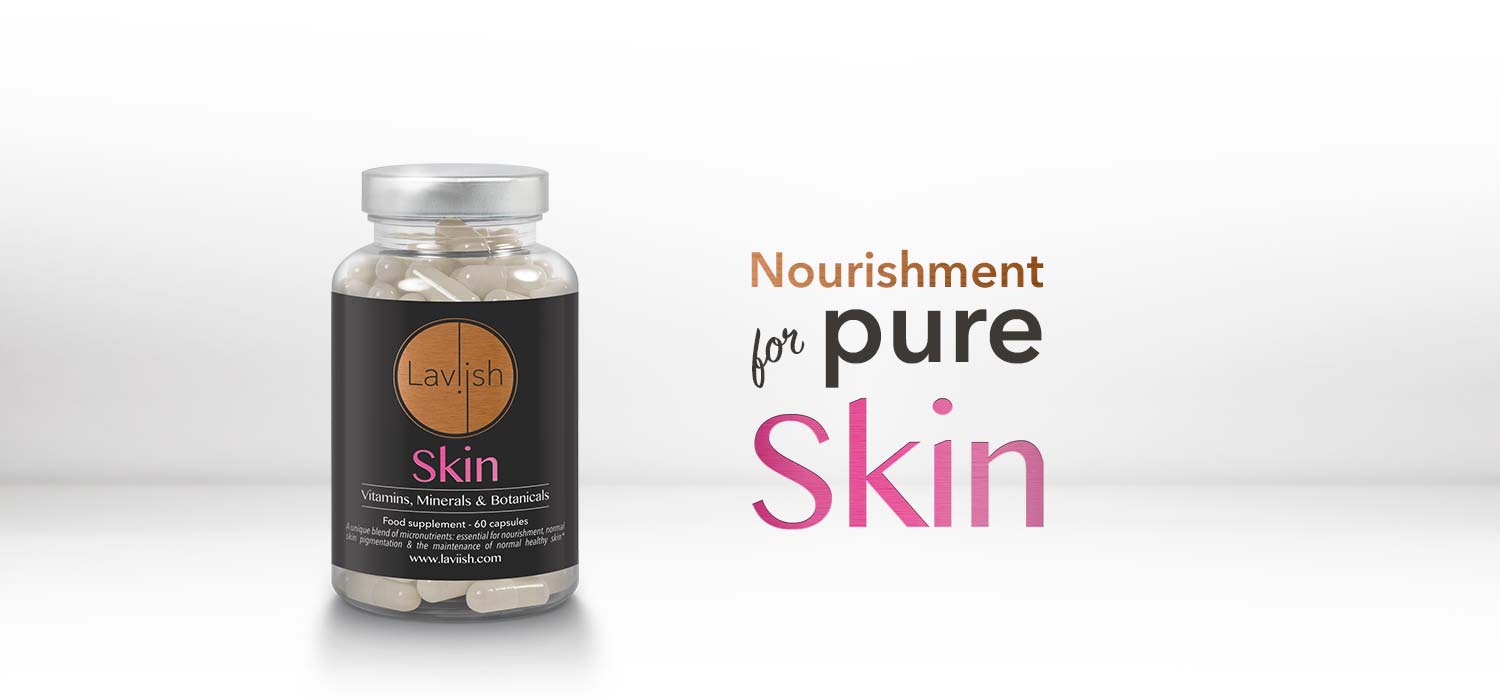
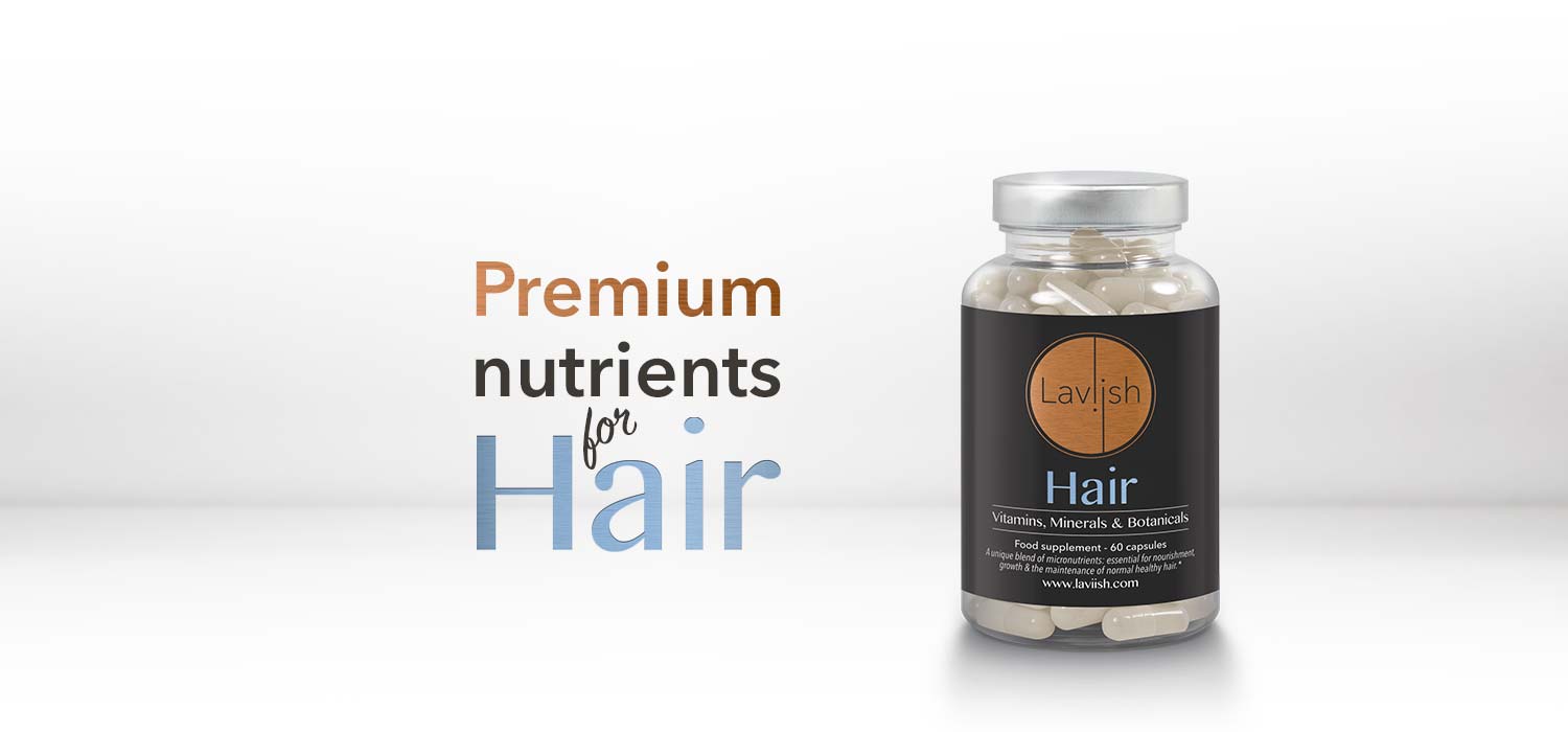
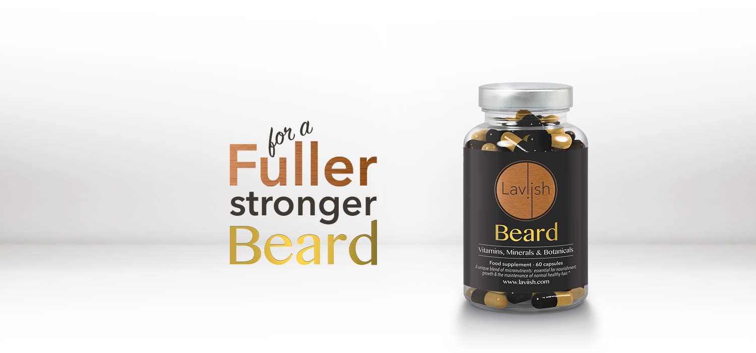
The product names were created to engage with the customer’s emotion. ‘Laviish® Hair’, ‘Laviish® Skin’ and ‘Laviish® Beard’ each suggest how someone might feel and what the results might be when you buy and use the products.
Logo Design
Only after researching and analysing the competitions’ visual identities could an original logo mark be designed for the Laviish® brand.
Hundreds of concepts were sketched and the best ideas were developed then presented to the eBeauty team. Part of the focus for the logo design was highlighting the double ‘i’s in “Laviish®”. One concept was chosen and developed into the circular metallic/copper logo now used across their product range and brand touchpoints.
Brand Identity Design
The Laviish® logo design concept was developed and presented within the context of a variety of brand identity options. These options included visual mockups so that eBeauty could imagine what their products, website and marketing might look like within an overall brand identity.
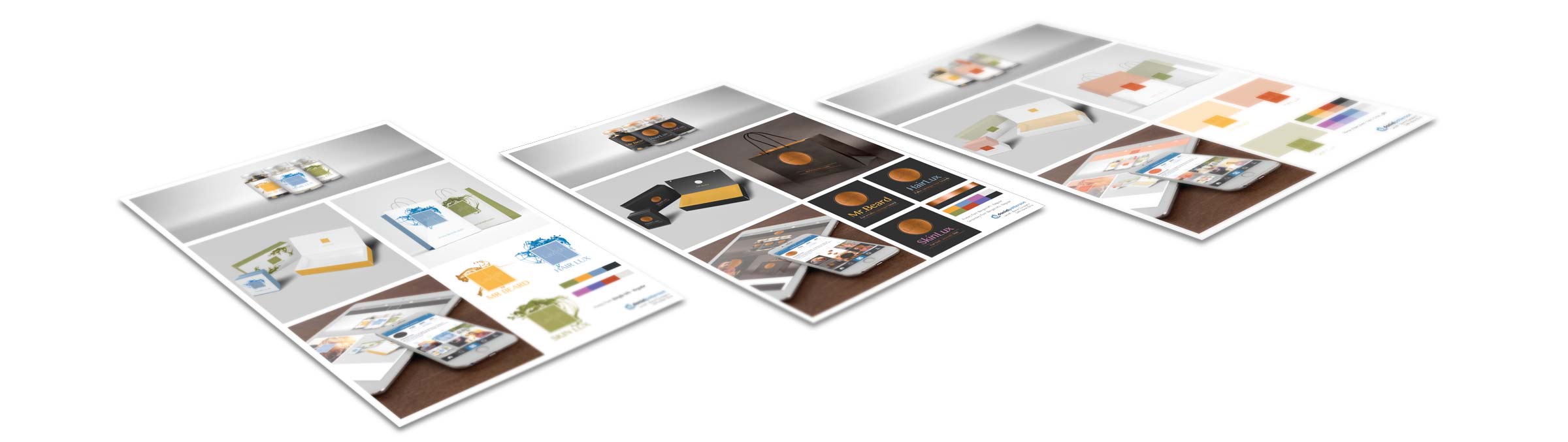
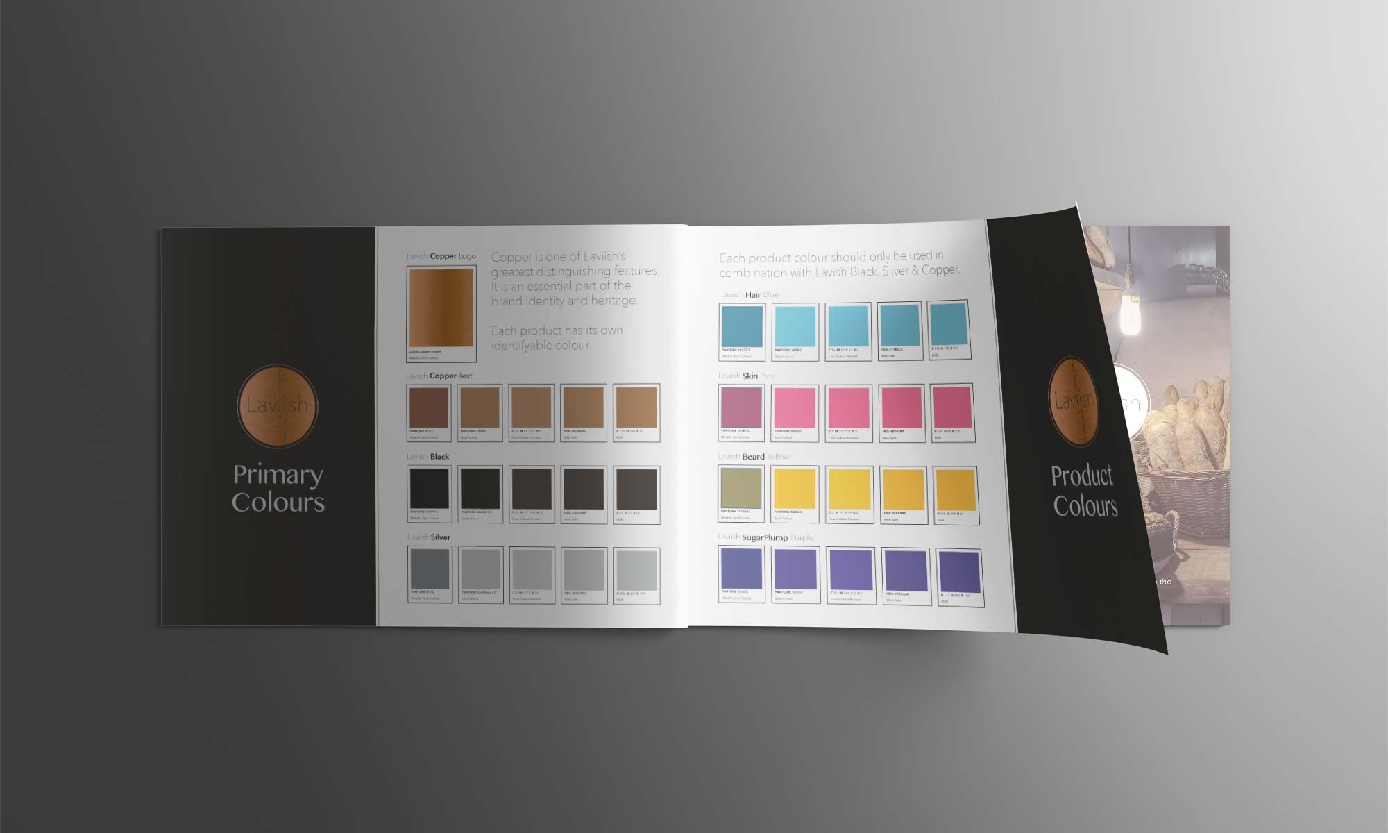
One brand identity design concept was chosen and developed to include a brand identity guideline manual for future reference. These brand guidelines would identify the brand’s mission statement, brand strategy, brand values as well as guidelines on how to use the logo, how to name products, colour specifications, use of typrography and images.
Product Packaging Design
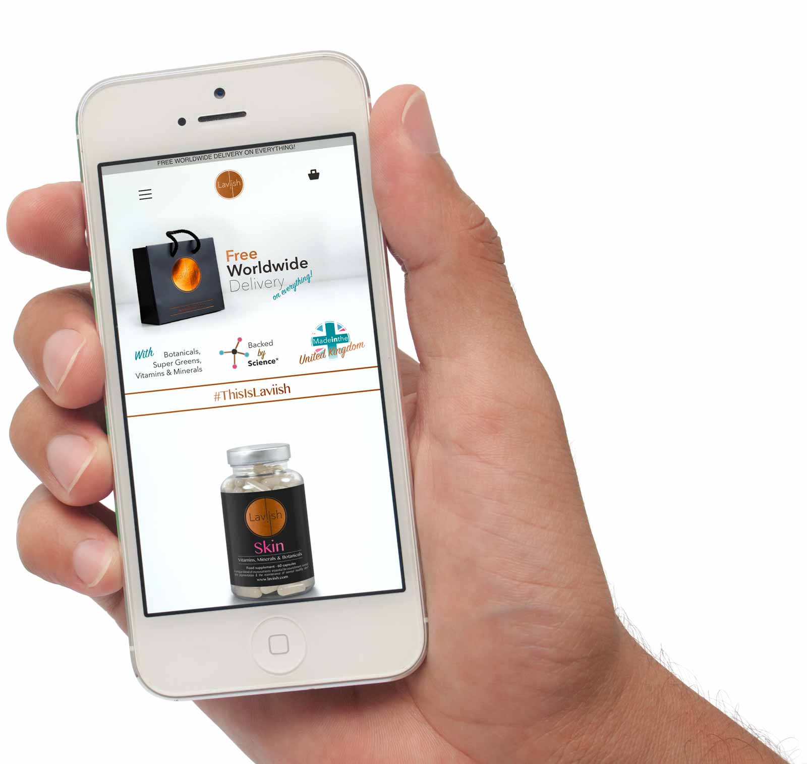
Whether a carrier bag or the bottle packaging, every detail of the Laviish® touchpoints were carefully designed to reflect the high quality of the product. With matt-laminated black covering, copper foil logo and silver foil text, the Laviish® products and packaging are easily identifiable amongst competition and quickly recognised.
To differentiate between Laviish® products, each product line has its own metallic Pantone® colour that compliments the overall brand colour palette
Website Design
As the brand primarily targets young adults who use Instagram, the Laviish® e-commerce website was designed & optimised for mobile. See the final results at laviish.com.